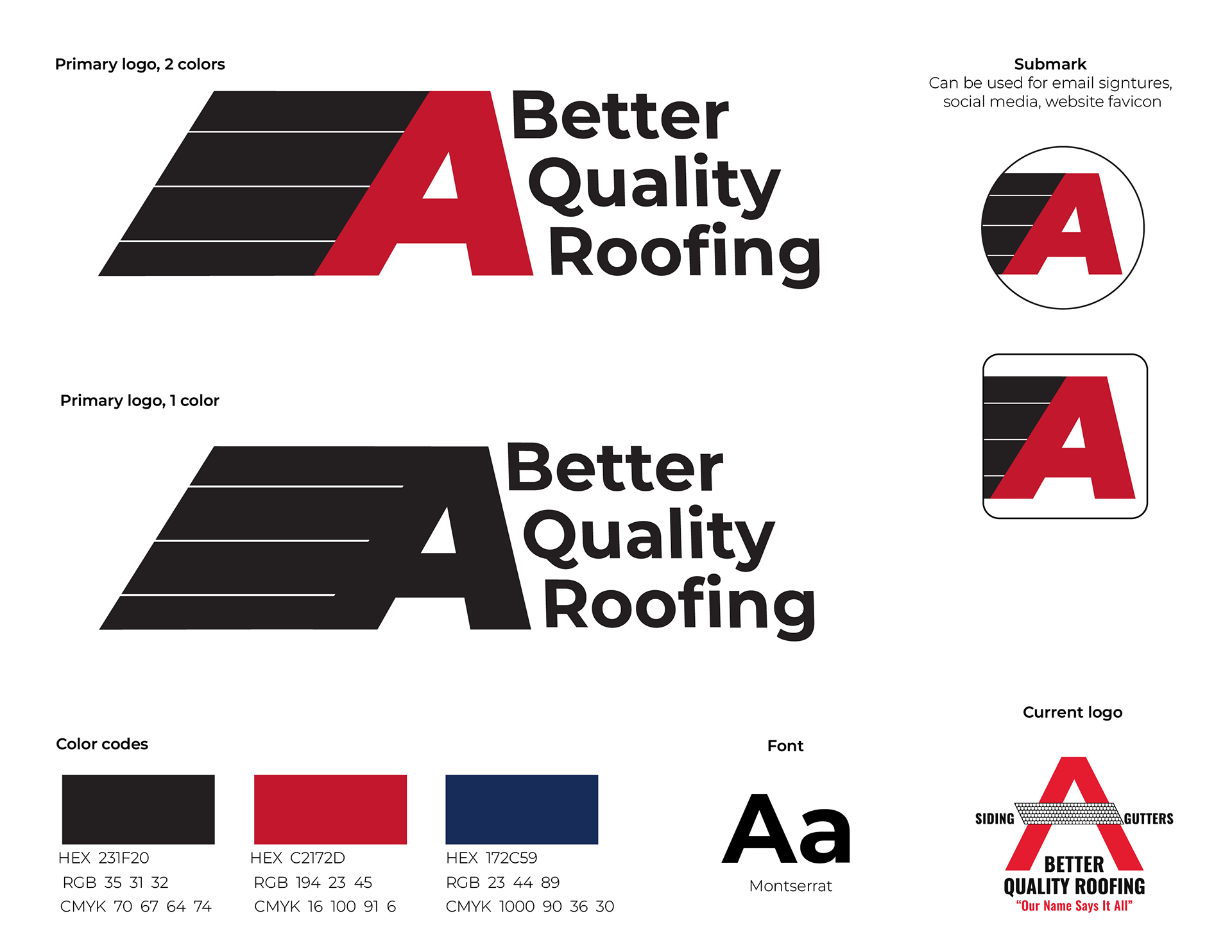
The original logo is so 'busy' and has extra copy that is illegible doesn't belong in a logo. The colors were a bit outdated and needed an update as well.
SOLUTION
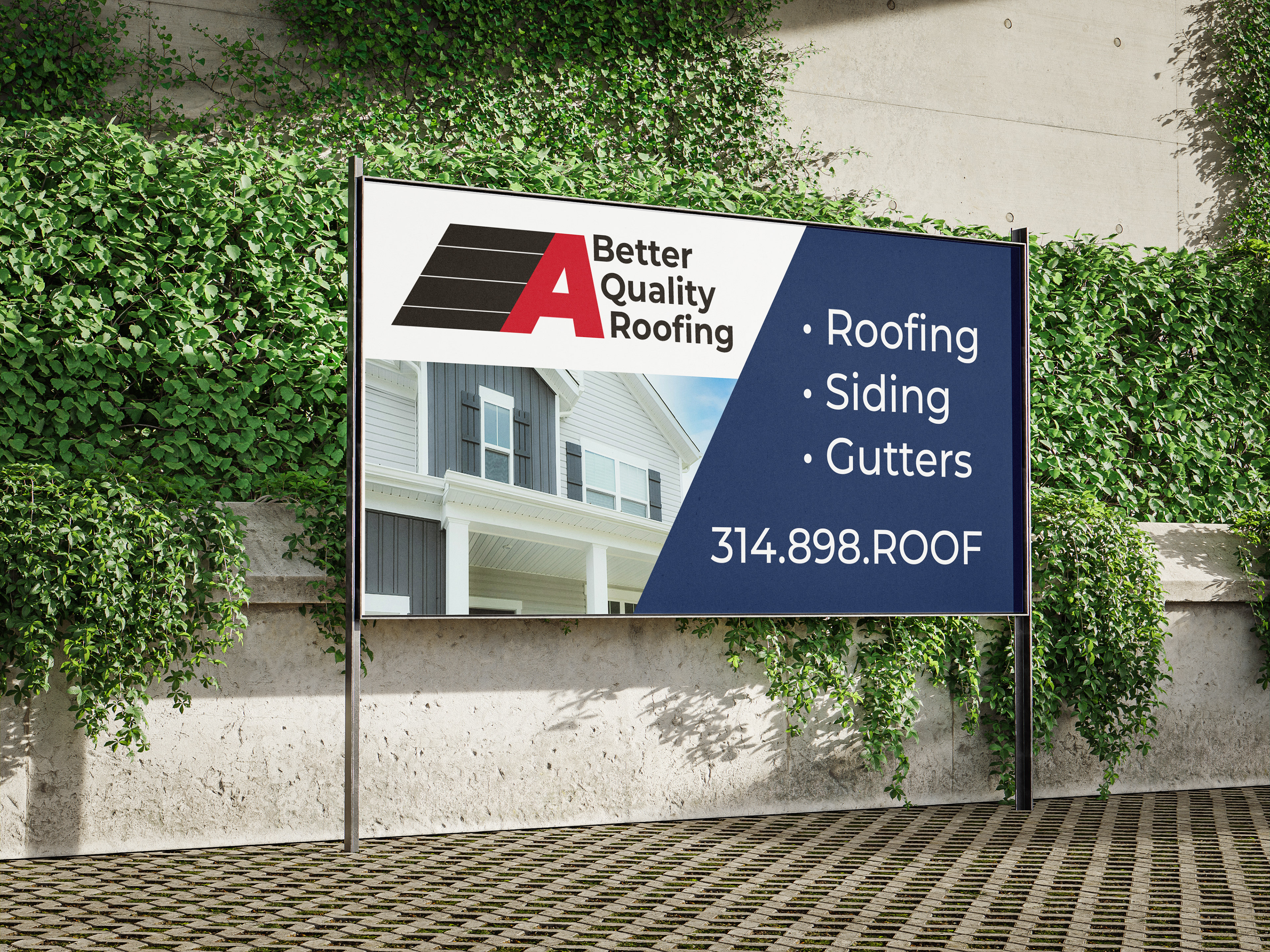
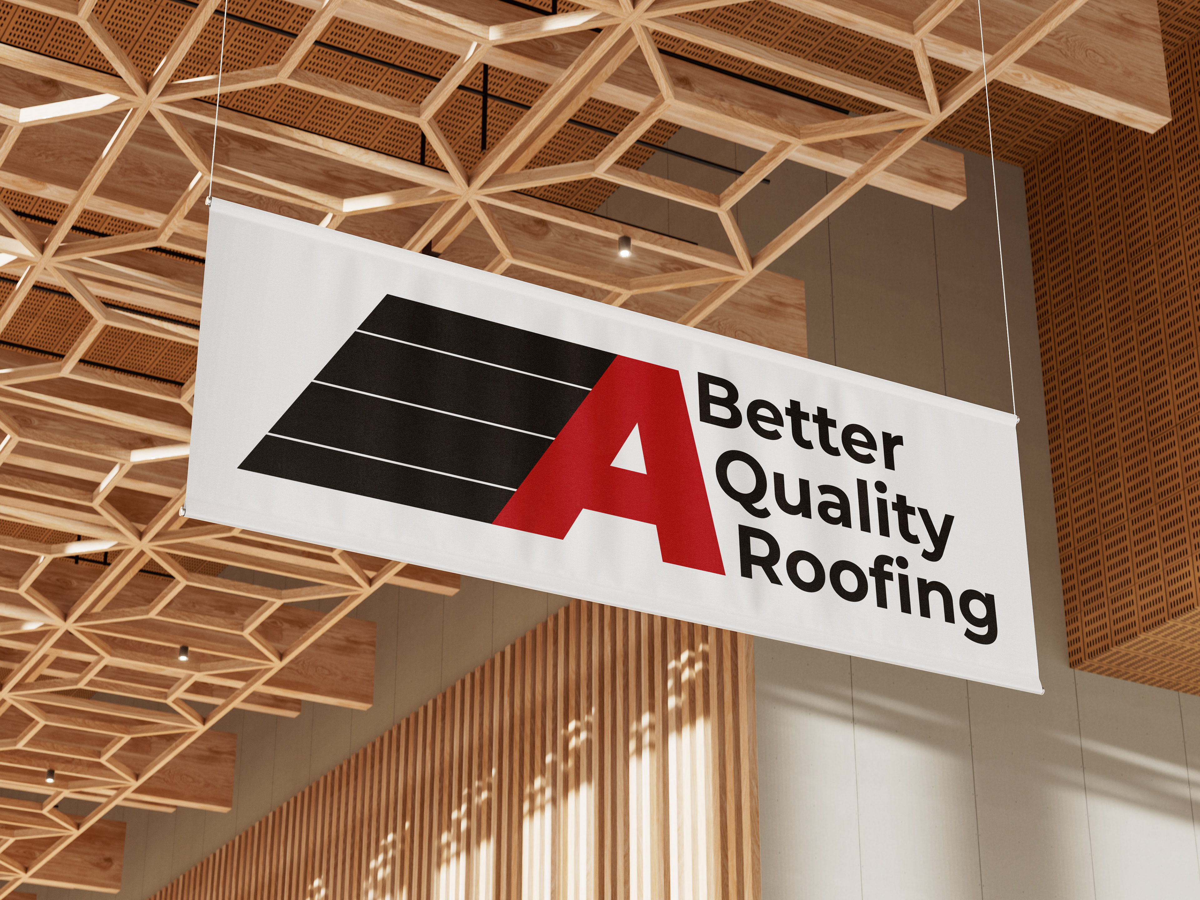
I wanted to simplify the logo, yet continue to incorporate the letter A into the design. By altering the letter A and adding linear segments that reference shingles it instantly becomes recognizable as a roof.
Because the logo icon is so big and bold, I used a typeface that had some curvature to it to soften the logo.
Color palettes are very important, so I changed their original black to a charcoal grey, darkened the red, and added a navy color to compliment the two dominant colors.