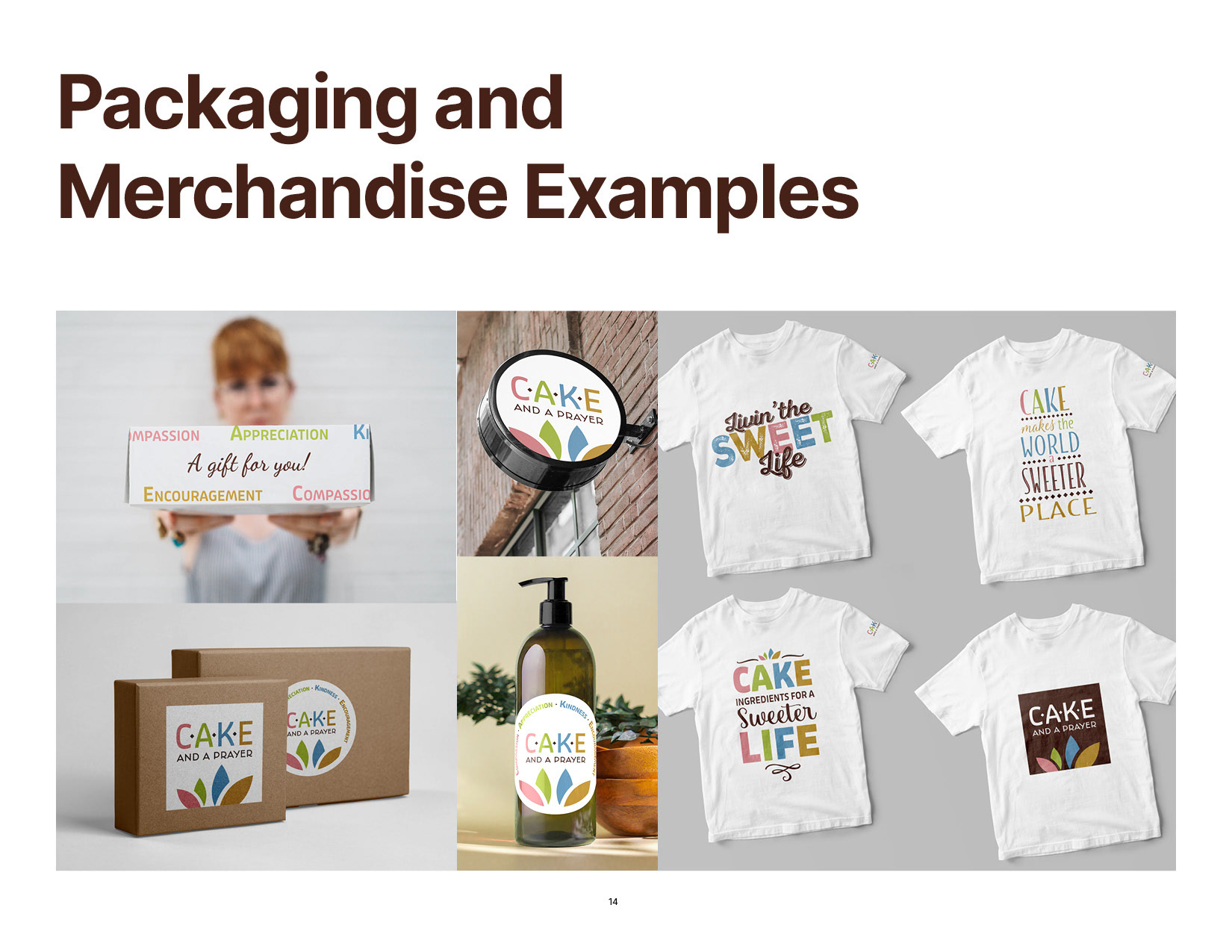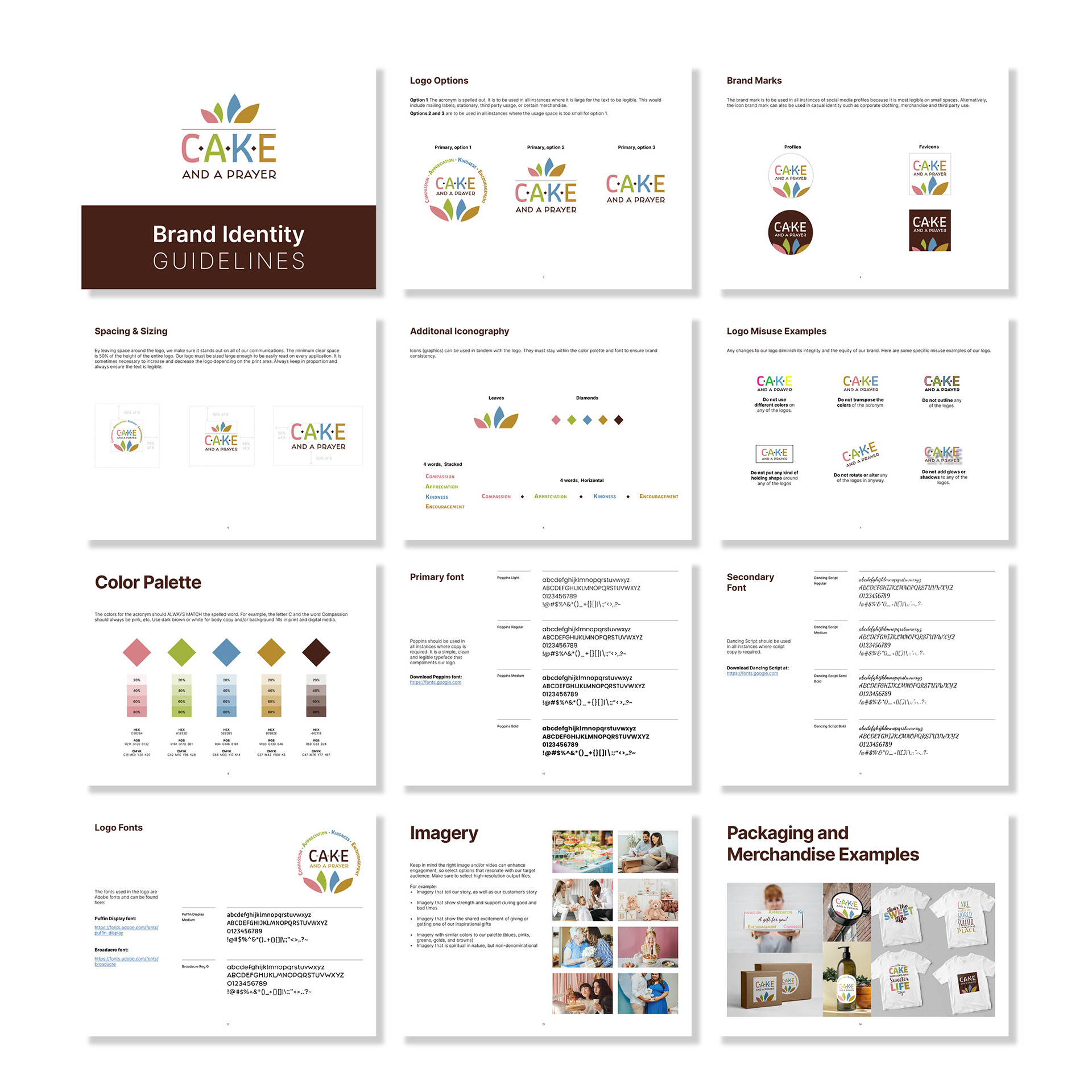
The client wanted to update their existing logo to have a brighter color palette, more legible font, plus they wanted extra versions of the primary logo that they could use in packaging collateral.
SOLUTION
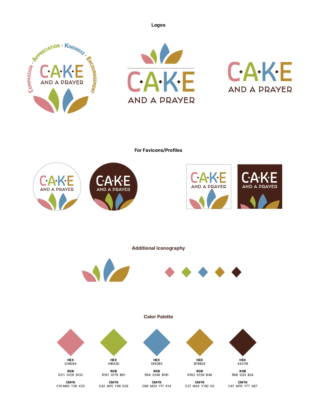
Acronym logos are never easy to design, and have to be configured correctly as to not take up a lot of space. The first goal was to create mood boards to help the client define their 'style preferences'. Once that was established, the next step was to blend prayer, baking and year-round into the logo design.
The colors are meant to represent the four seasons, and the thin line above the CAKE acronym represents the top of a cake. And, the 2 leafs look like cake decoration, but also could even reference prayer hands.
I created final versions of the logo for both print and digital formats. I also created a brand guidebook for them to reference.