DPG's logo was outdated, and needed a refreshed look, more legible font, and brighter color palette.
SOLUTION
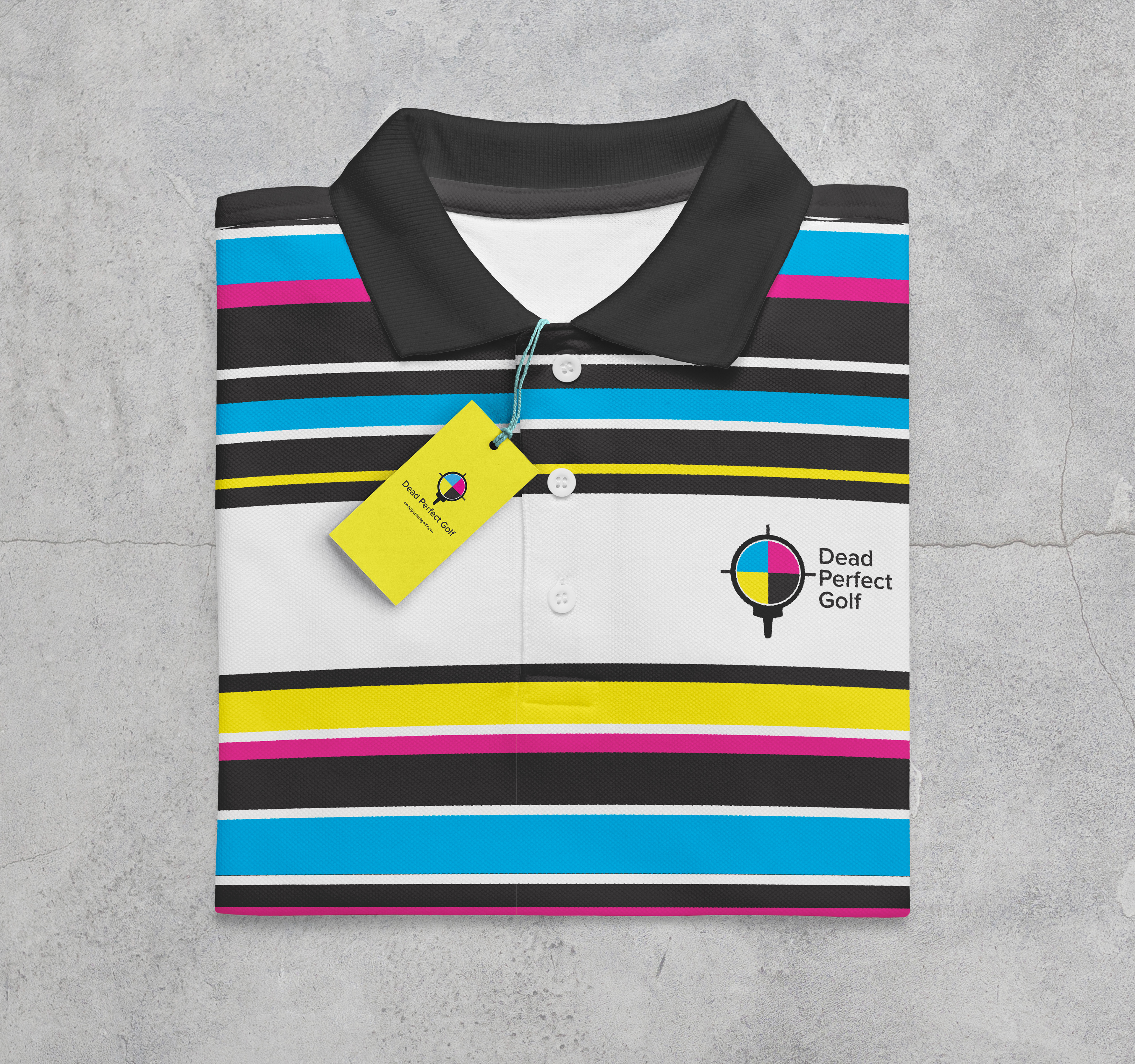
They are a printing company exclusively for golf sports. I instantly knew I wanted to incorporate printer specs in the logo design. I knew that print registration marks look exactly like cross hairs, and the 4 cmyk colors would fit perfectly in the circle, I then added a tee shape below them. It instantly references focus, drive, golf, and print - everything the company is about.
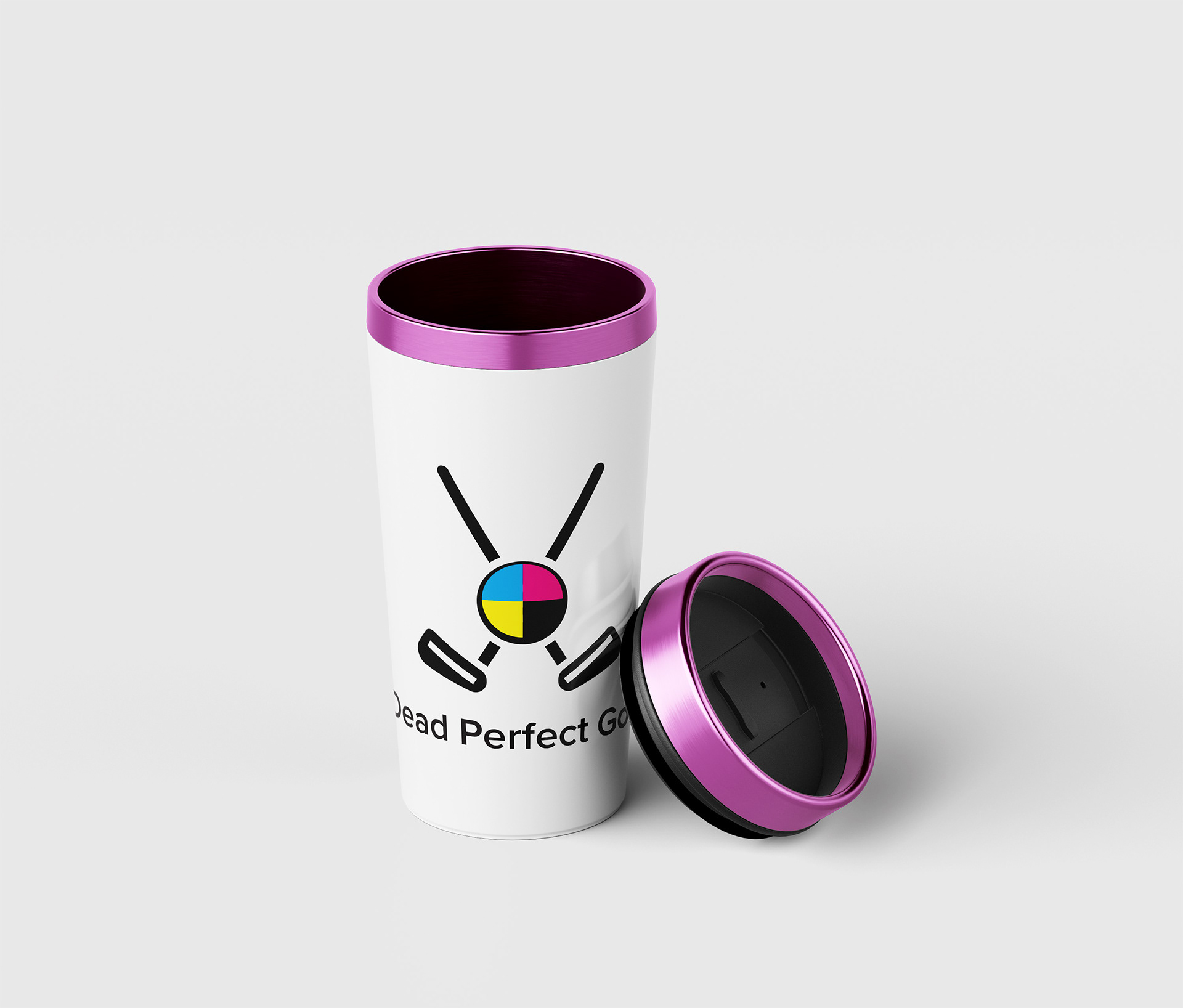
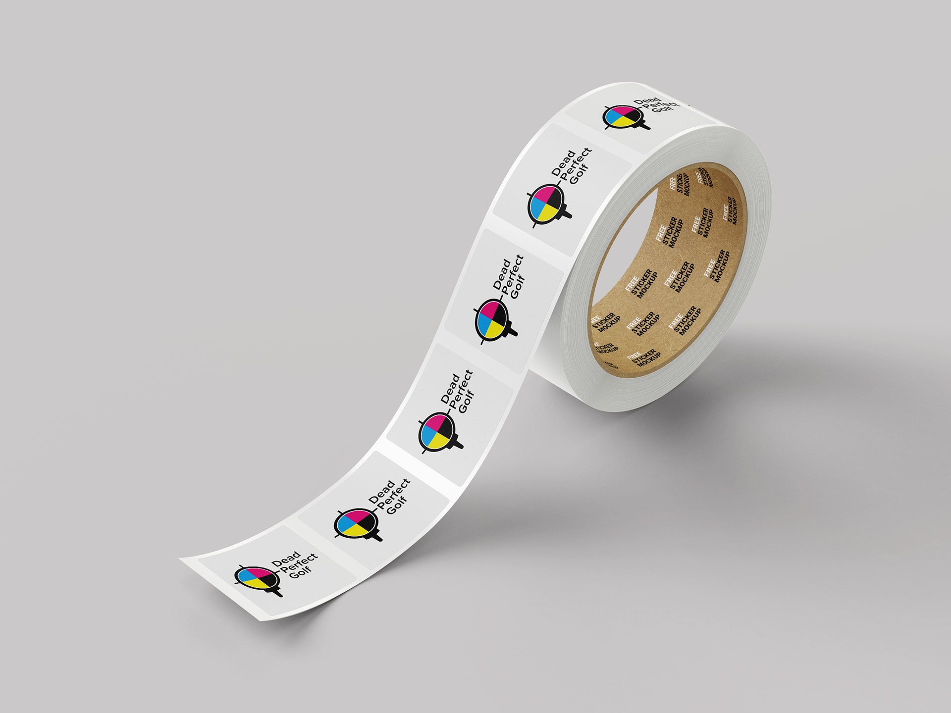
Final step was finding additional graphics where I could implement the multi-colored golf ball.