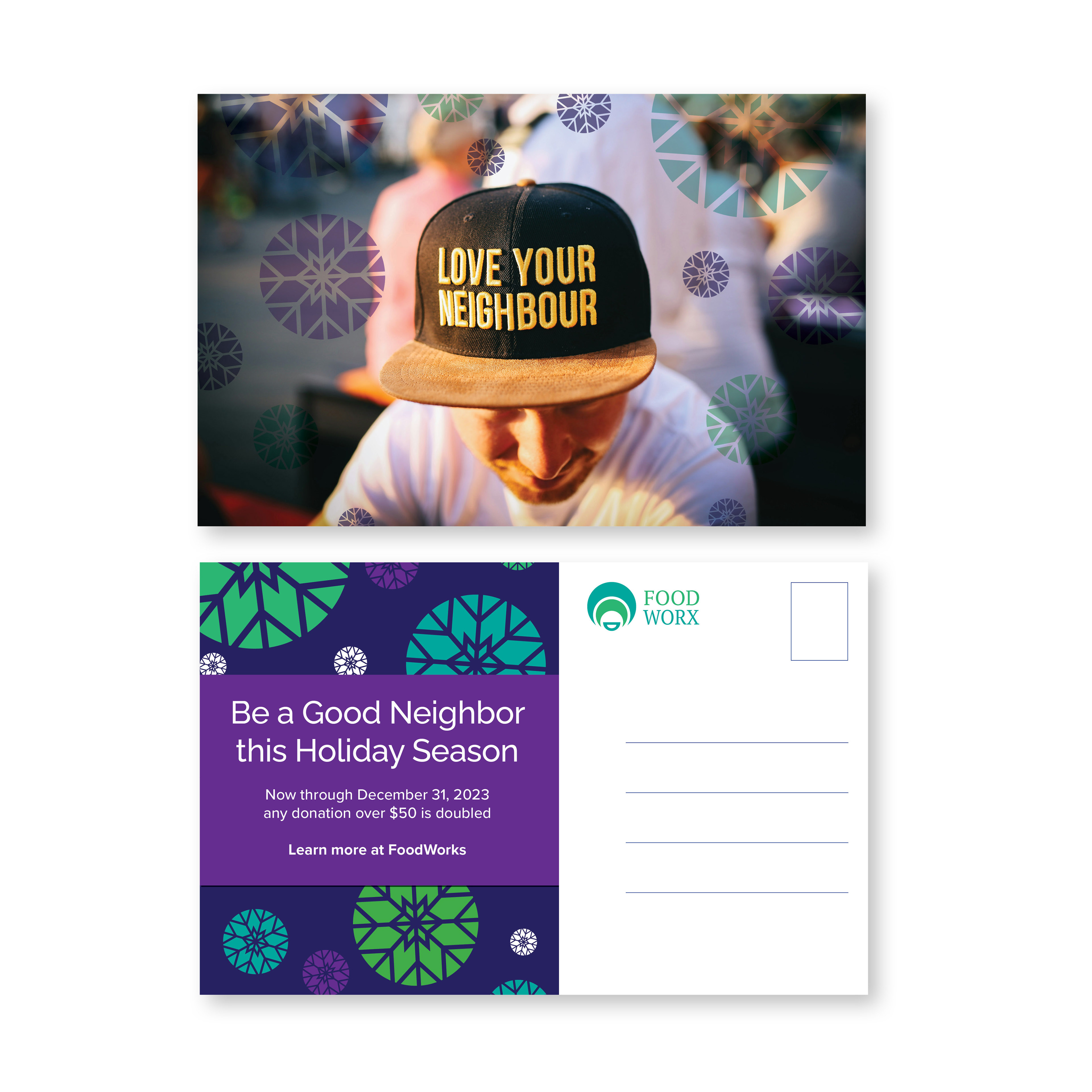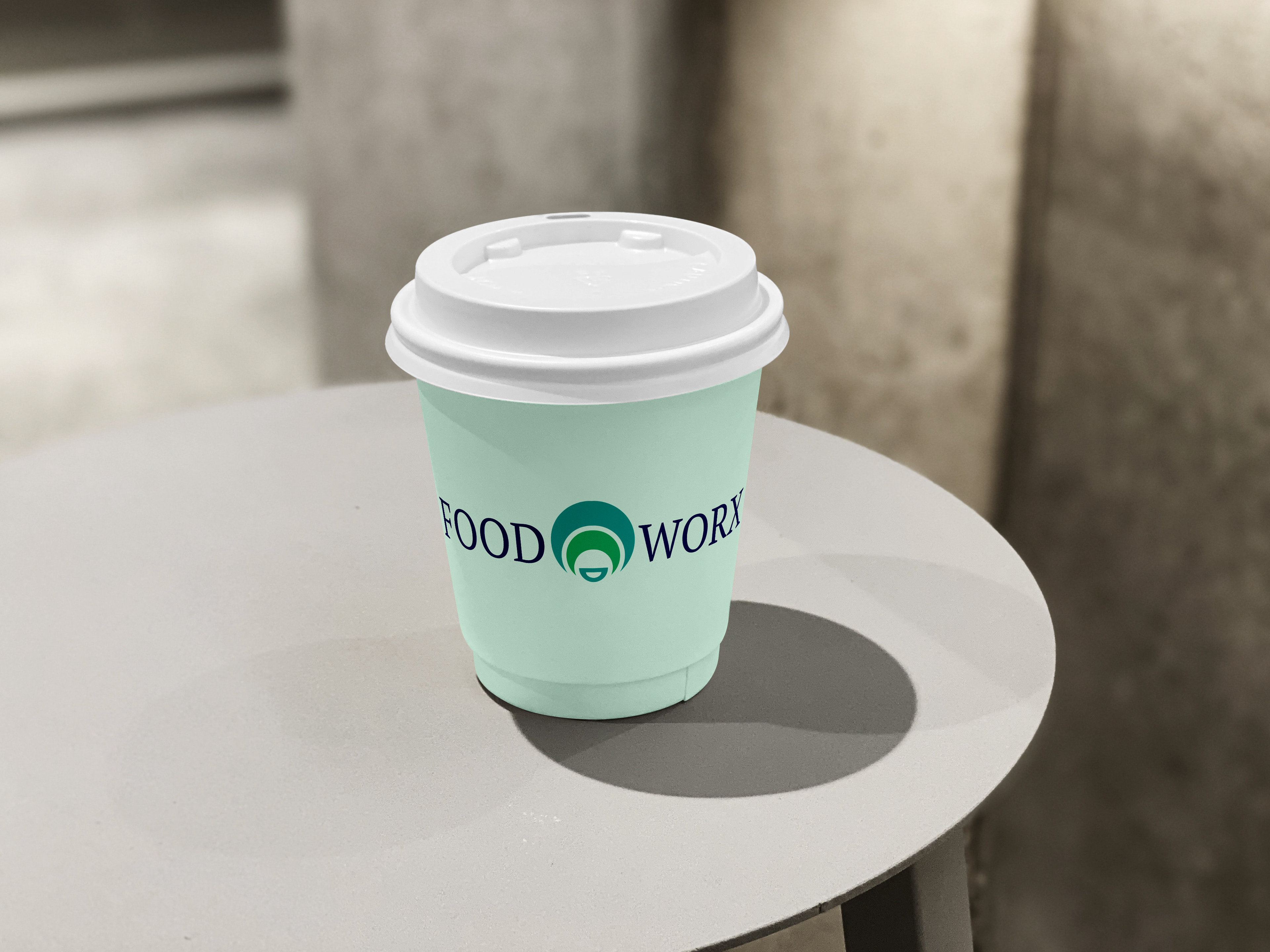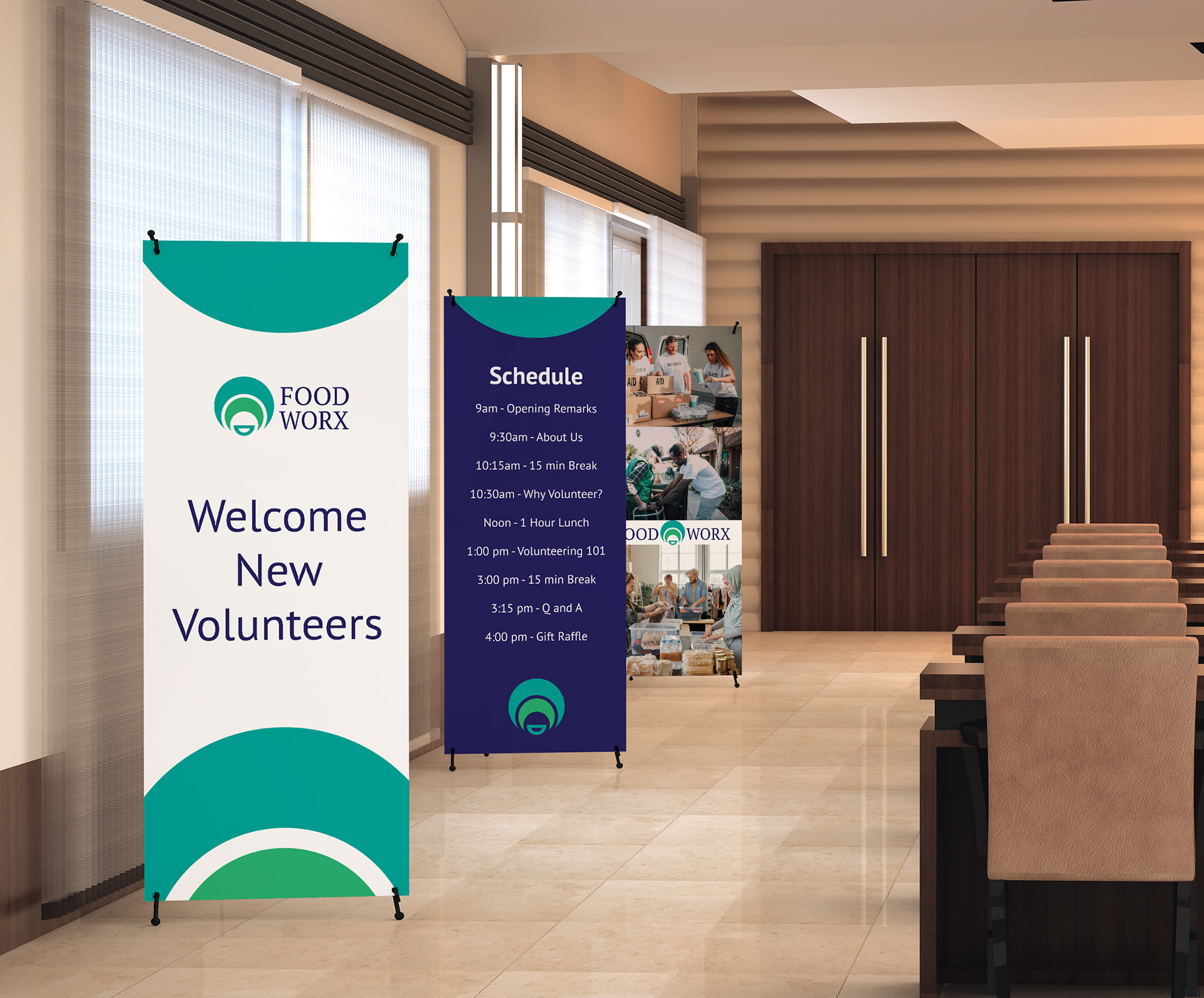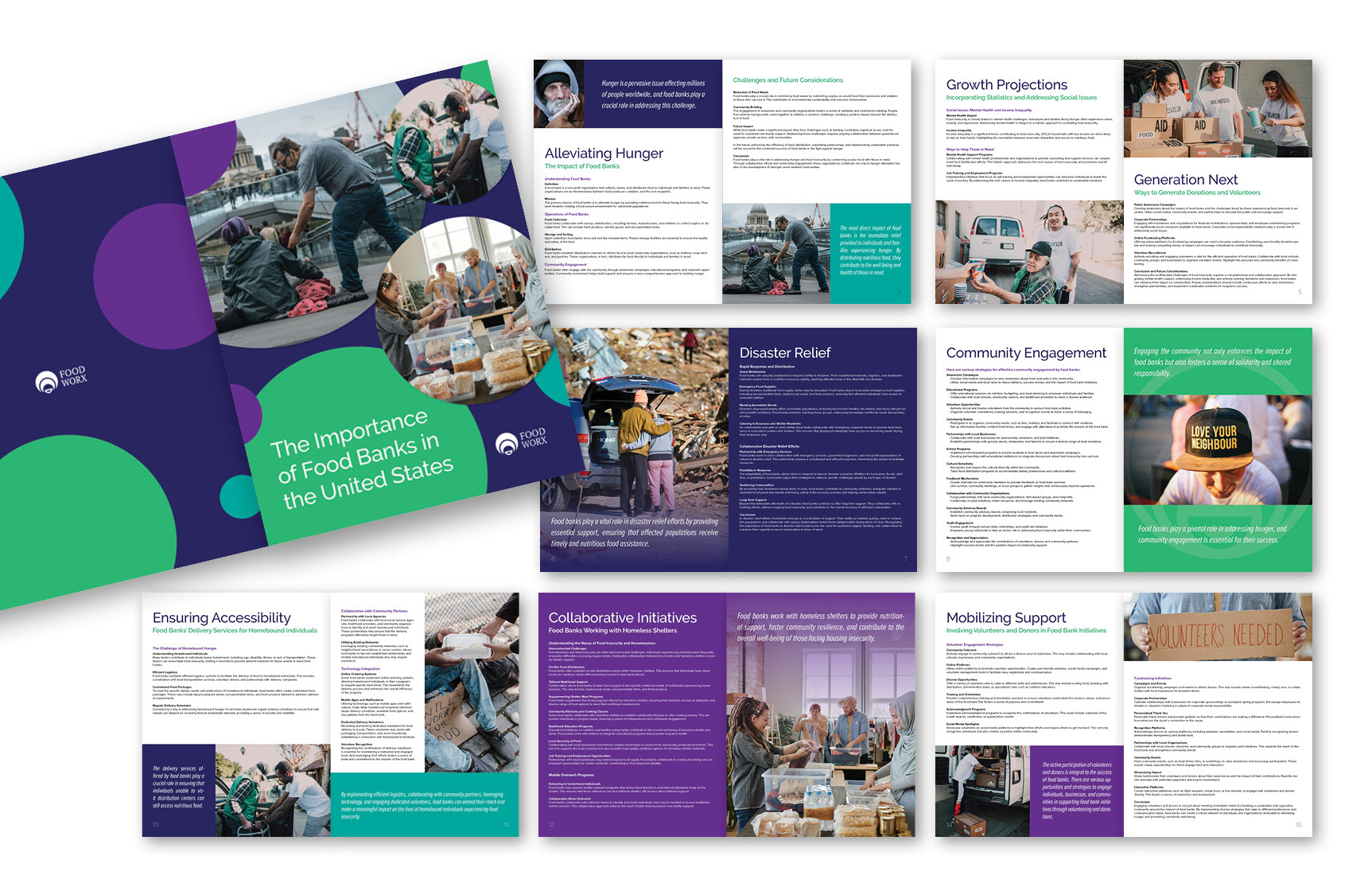
Food Worx is a new organization that needed full brand design and some print collateral as well.
SOLUTION
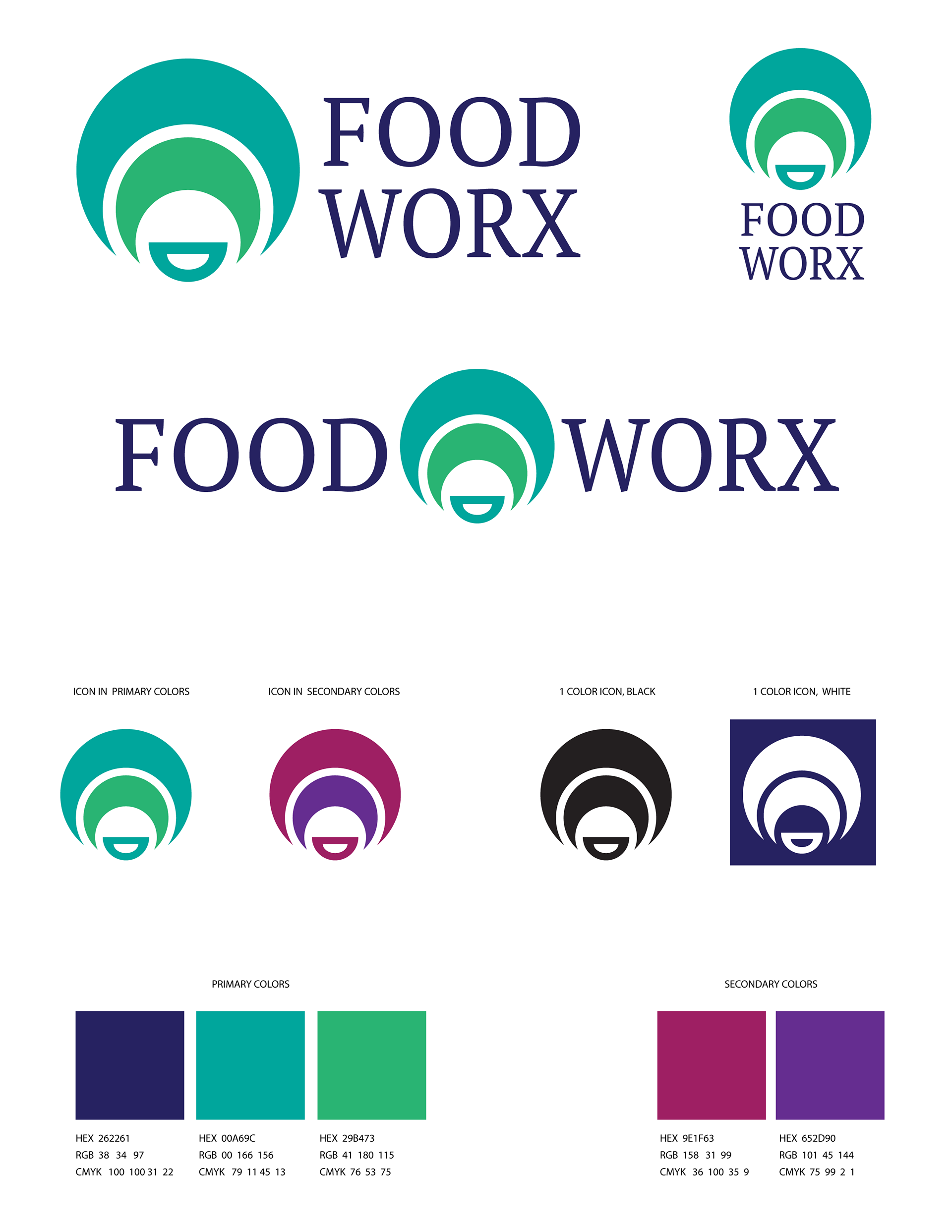
My intention was to create a clean logo with color palette reminiscent of fresh produce (greens, reds, purples). Obviously the icon represents plates and bowls, but subconsciously, it has an energetic feel that represents connectivity, growth, and unity.
Knowing this logo will be heavily used in print collateral, I intentionally chose a legible typeface and darker color palette that could be printed 1 color, Pantone colors, or full color.