Occasionally I stumble across a company logo that is so difficult to read that I feel compelled to try to re-design it. That is the case with this company's brand logo.
SOLUTION
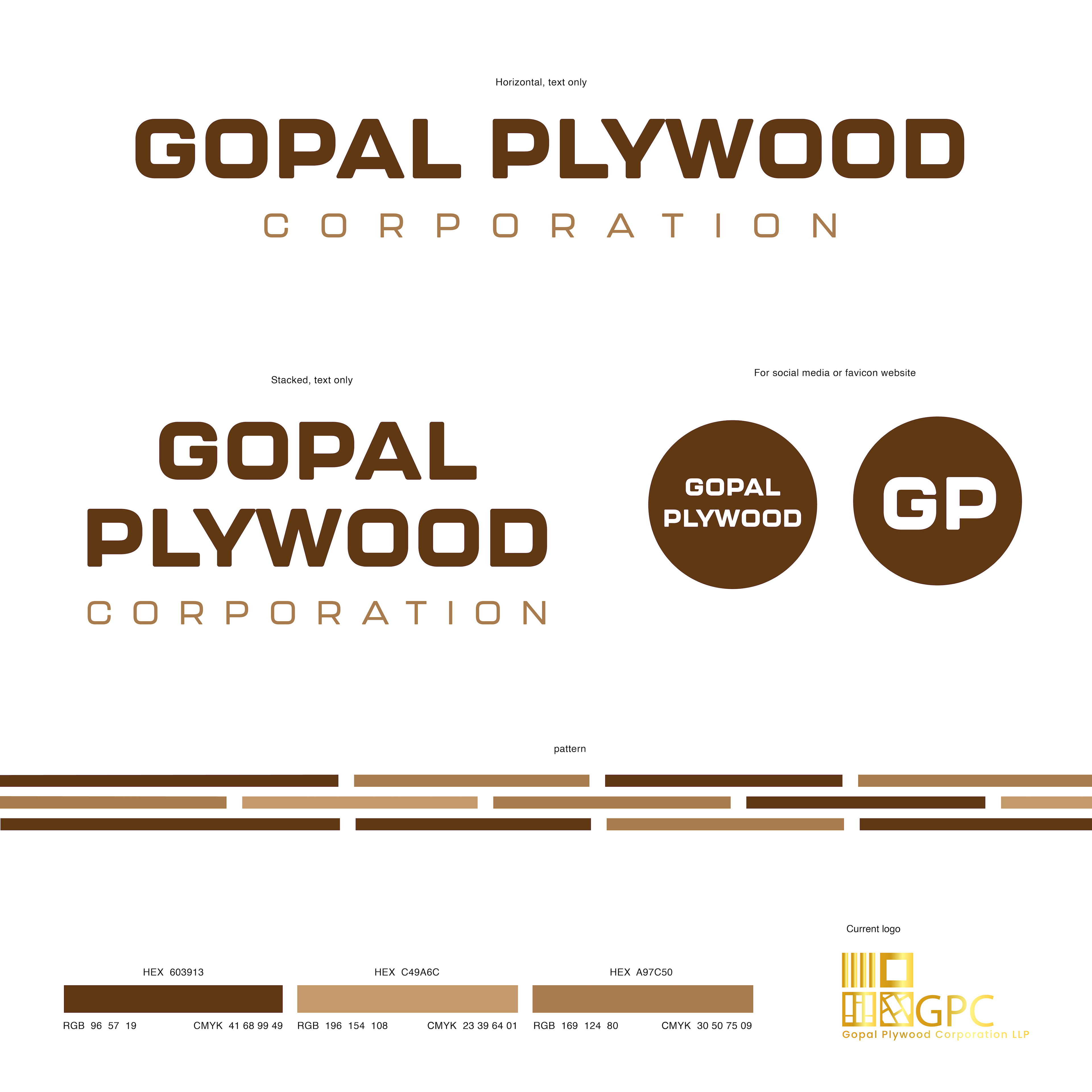
My solution was to develop a new brand design that represents their business - they sell plywood. Instead of using 4 icons as they did in their original logo, I chose to create a simple, linear design that can grow with their business if they decide to expand to other woods, flooring, cabinetry, etc.
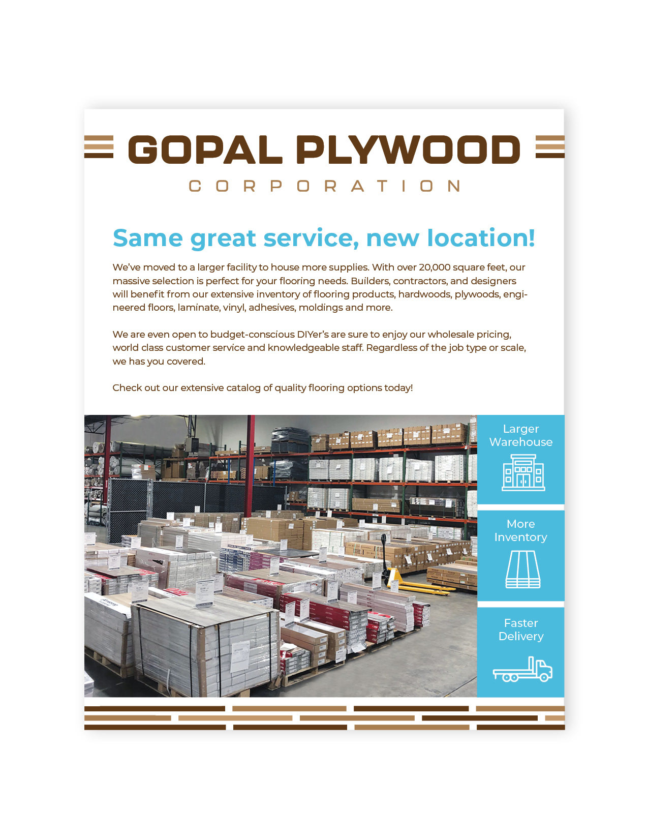
The next step was choose a font that is big and bold, altering it slightly for some originality. I opted to use a mix of warm-toned browns with a bright blue. The browns are easier to read at long distances (vehicles/signage), and the bright blue really pops on digital and print materials.


