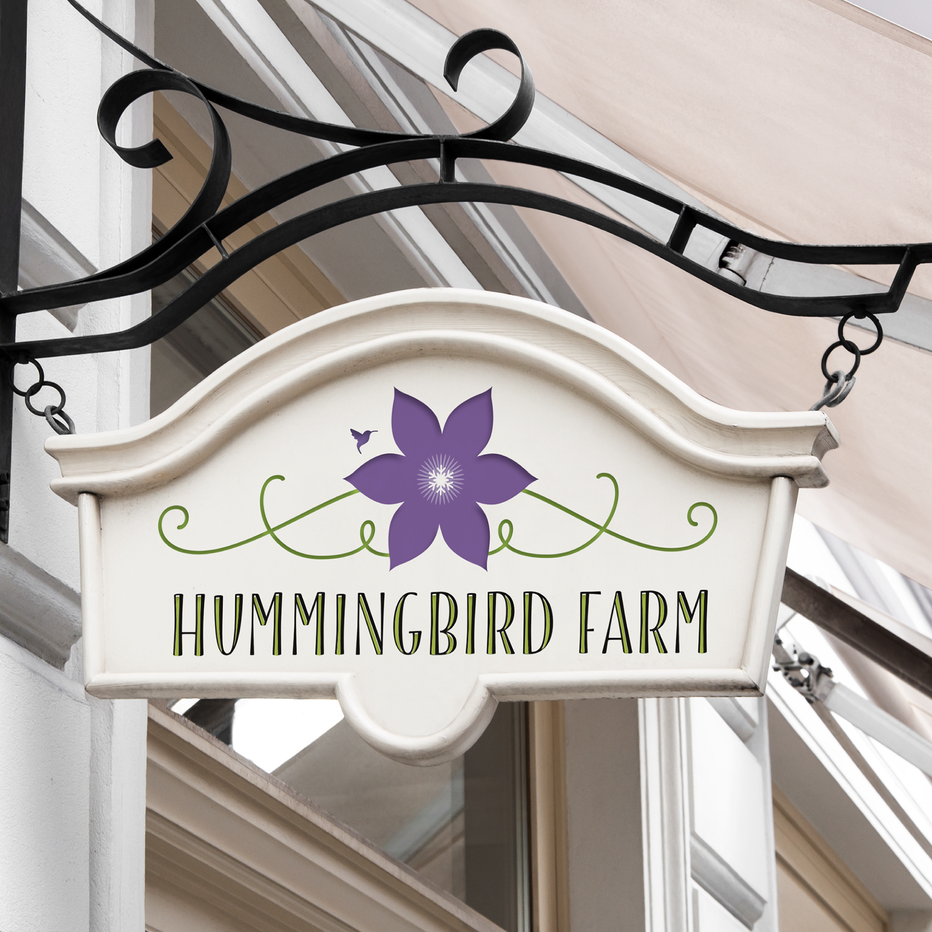
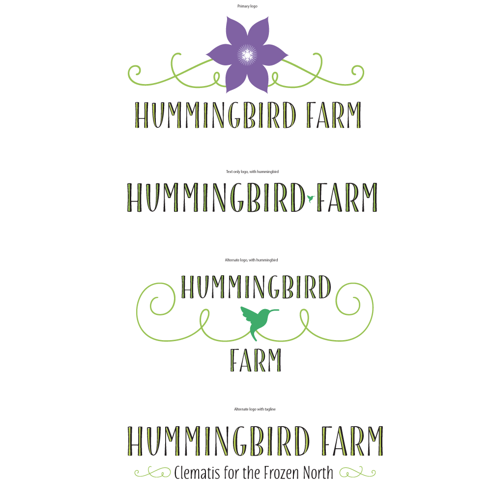
While their original logo has a level of elegance to it, it is also busy and lacks direction. They need a new logo that can still look ornate and stylish - yet way more simplified.
SOLUTION
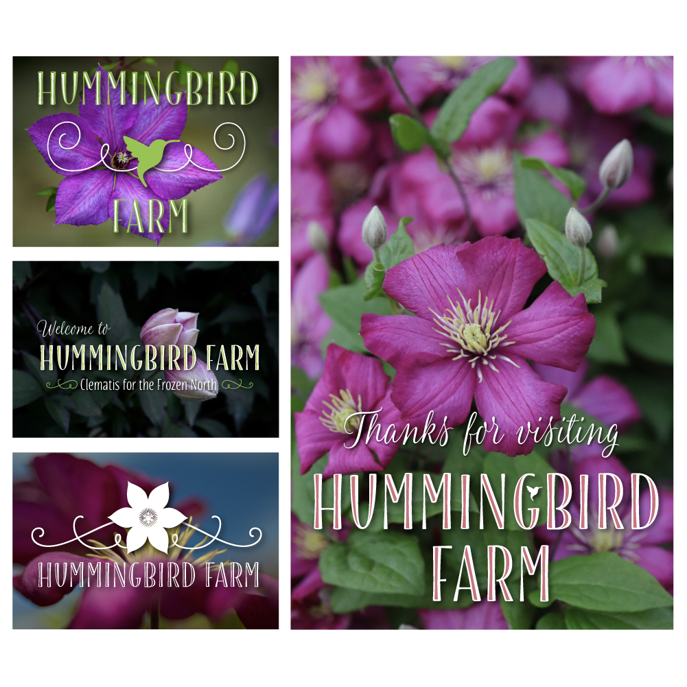
I wanted to use a single clematis flower in the logo, so it can also be included in the brand mark. to anchor the flower in the horizontal logo version, I added some swirly scrolls to resemble the vines. For a subtle nod to the 'north' I put a snowflake in the center of the flower. The typefaces are an intentional combination of chic, ornate, and handwritten - all perfect for a flower farm. I expanded color palette to include warmer, brighter colors as well.
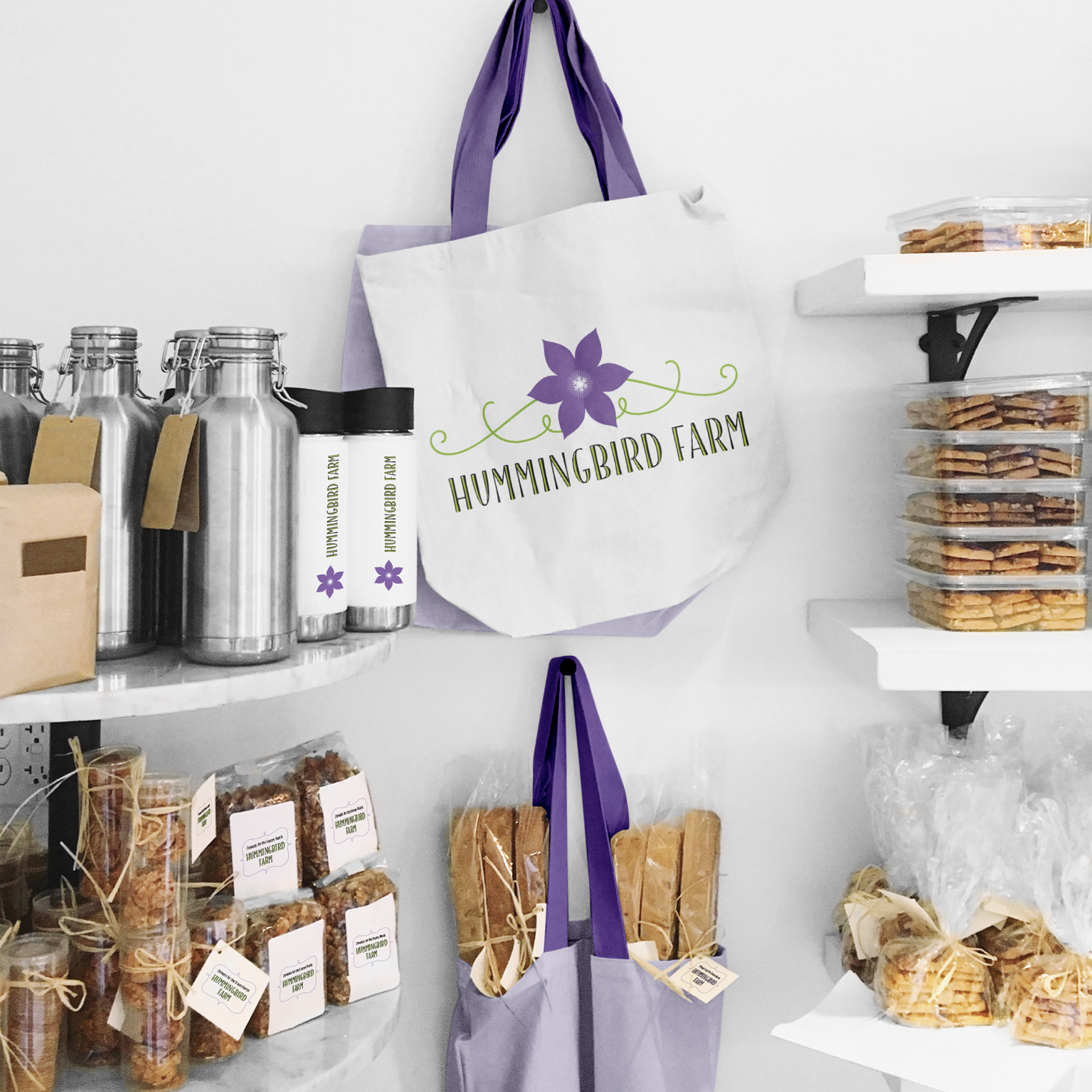
While my version of the logo still has an elegant feel, it definitely more modern and identifiable now.
