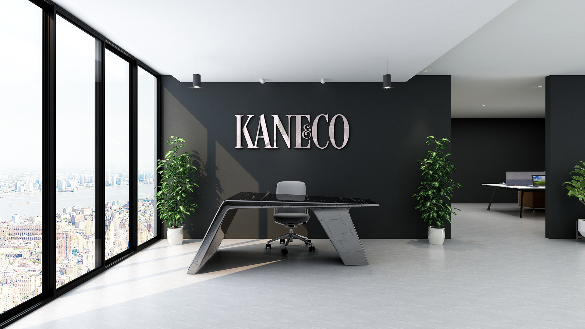
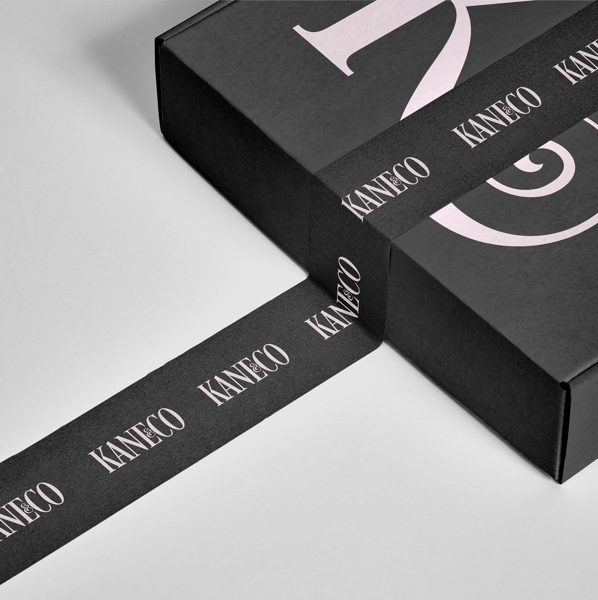
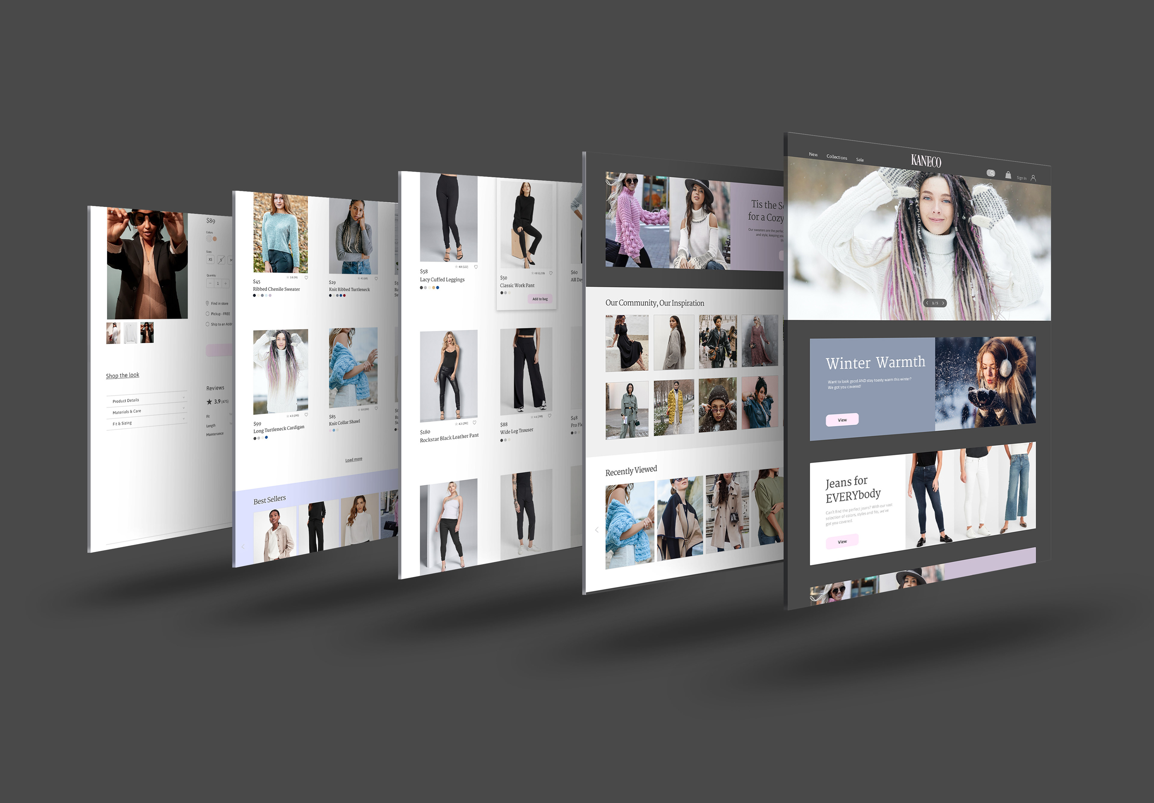
Kane & Company wanted to update their brand identity to be more elegant and feminine, including the logo, brand guidelines, and a re-design of the website.
SOLUTION
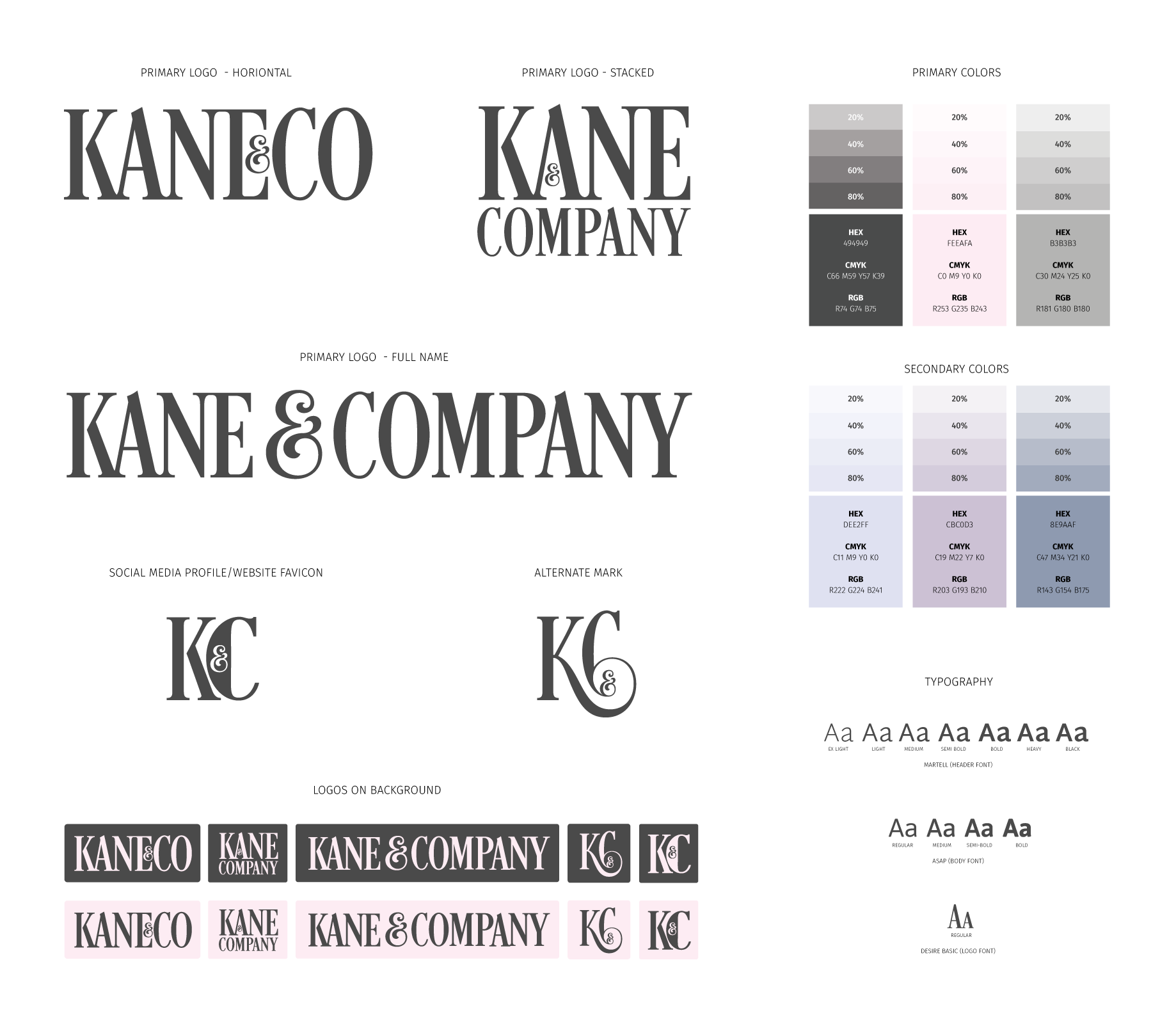
I wanted the primary colors to be a contrast of dark grays and pastel pink as it can be impactful, yet provide a sense of elegance.
The typography is narrow to appear bold and strong, but the slight serif makes is look professional. I included many alternate layouts for primary, secondary and sub-mark logos that can be used in print and/or digital formats.


