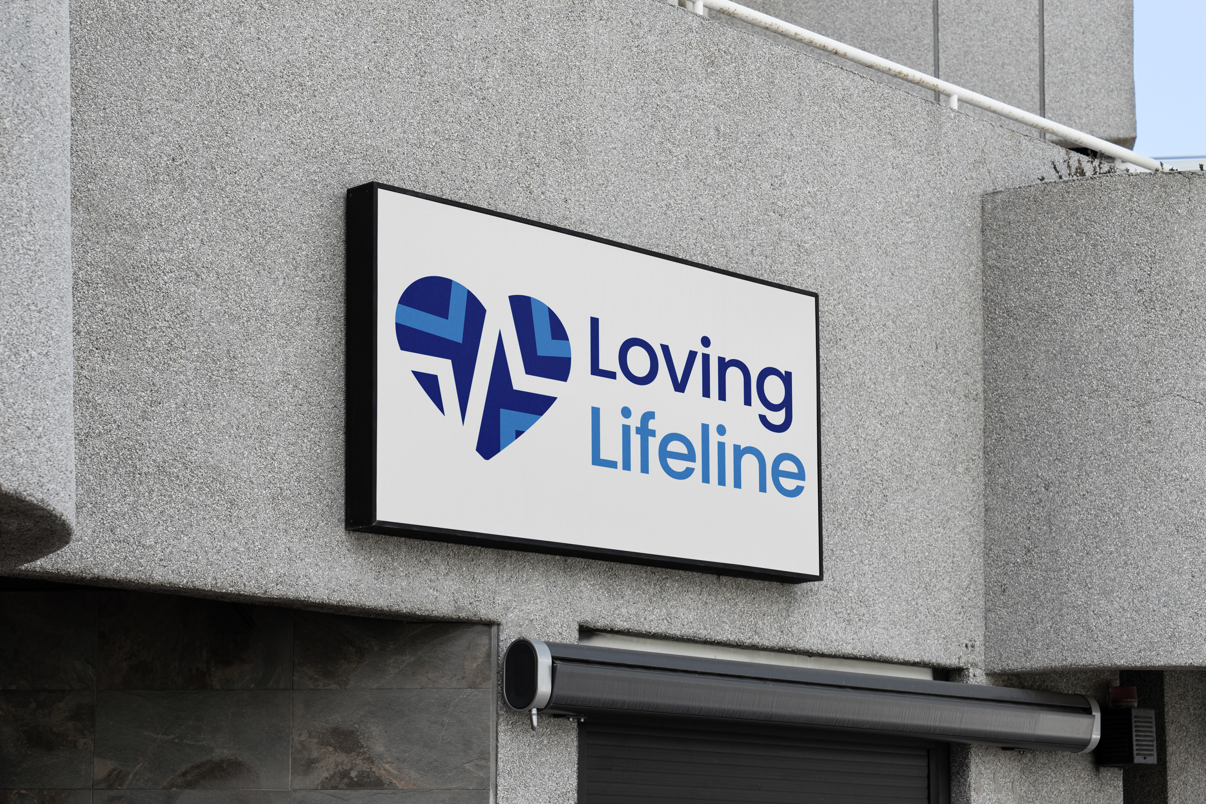
This business reached out to me to develop a new brand identity for physical rehab facility. Their existing logo had too many elements, and was difficult to decipher what it represented. The client requested that a recognizable shape of a heart be in the logo as well as use the existing color palette.
SOLUTION
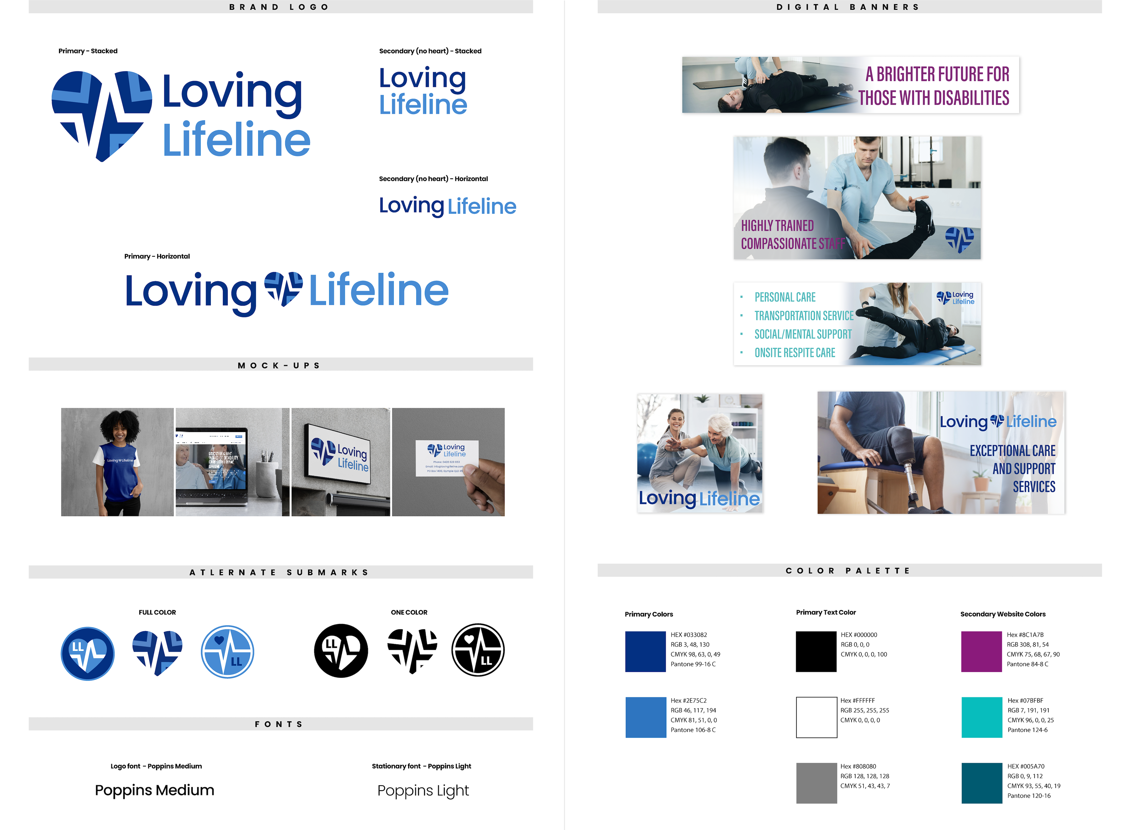
My solution was to create a logo that was instantly recognizable as a healthcare company. Adding a heartbeat line through the center of the heart signifies they are a ‘lifeline’ to the people they service. I rotated angular 'L' shapes into the heart as a nod to the company's name.
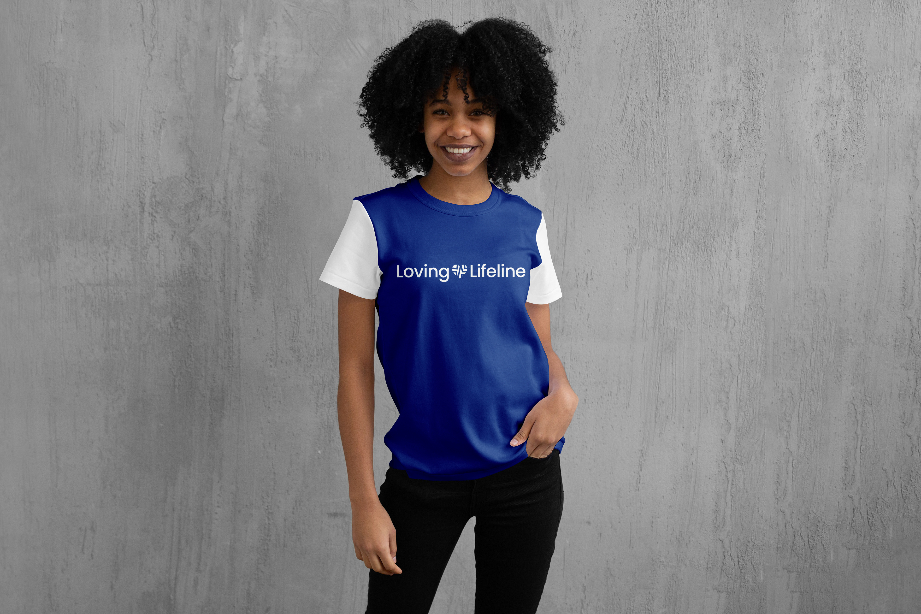
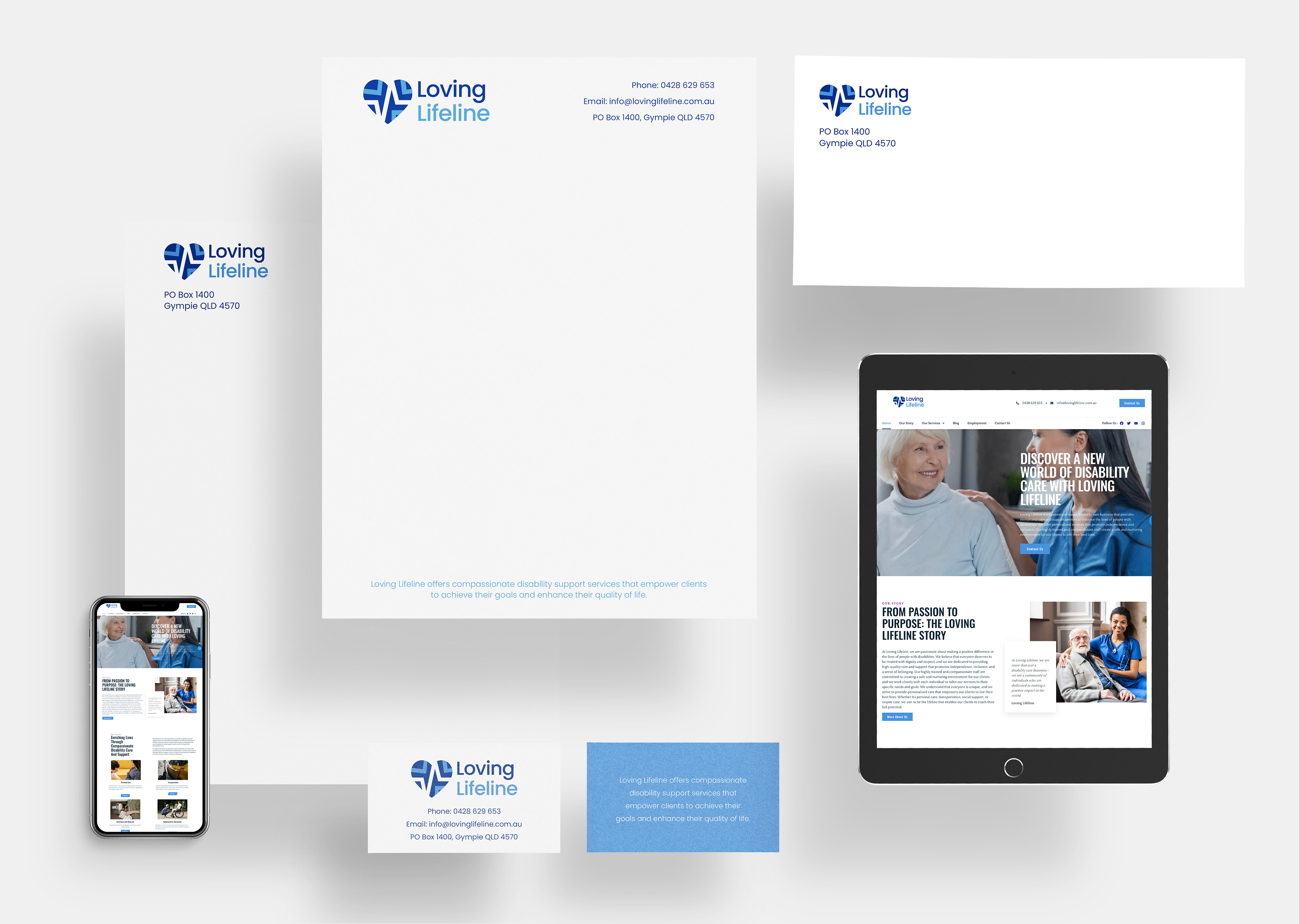
I also created additional icons that include all the elements (heart, heart line, letter L) but are versatile enough to be used for internal communications, staff wearables, signage, stationary, etc.
