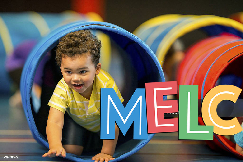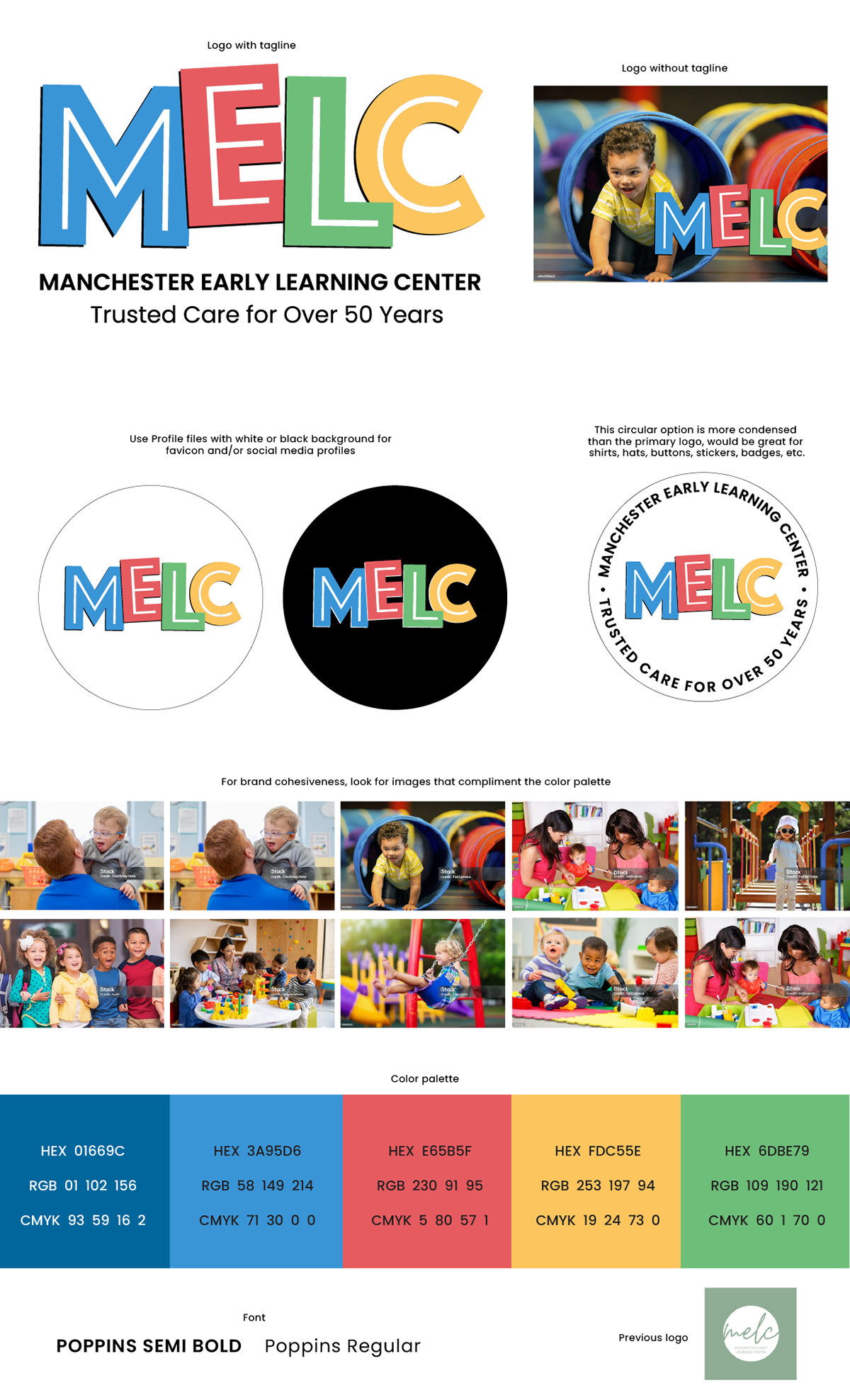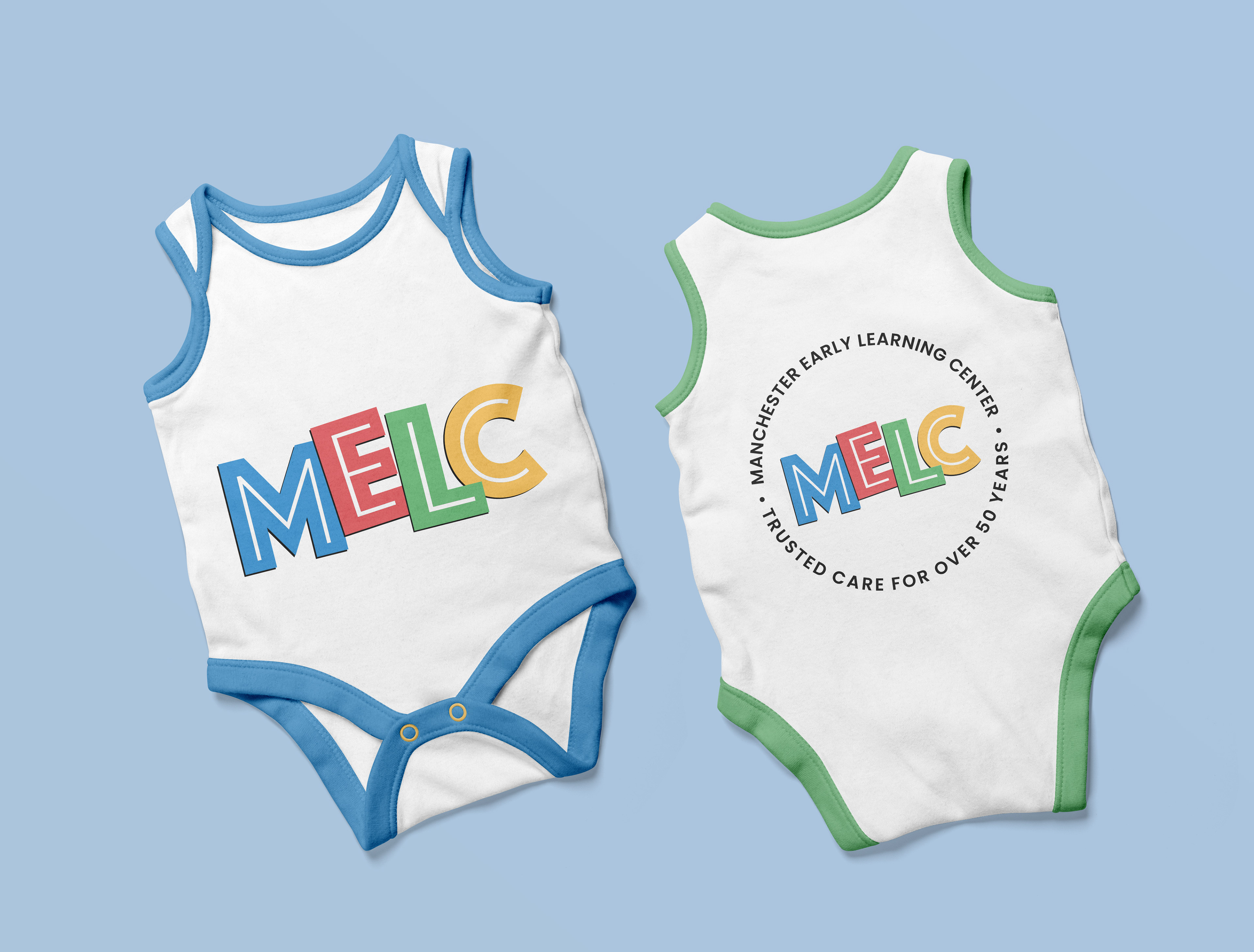
MELC is an early learning center that has been in business for over 50 years. They were not happy with their existing logo and wanted something new and refreshing.
SOLUTION
The only requirements was to use primary colors and a typeface that is easy to read for kids and adults.
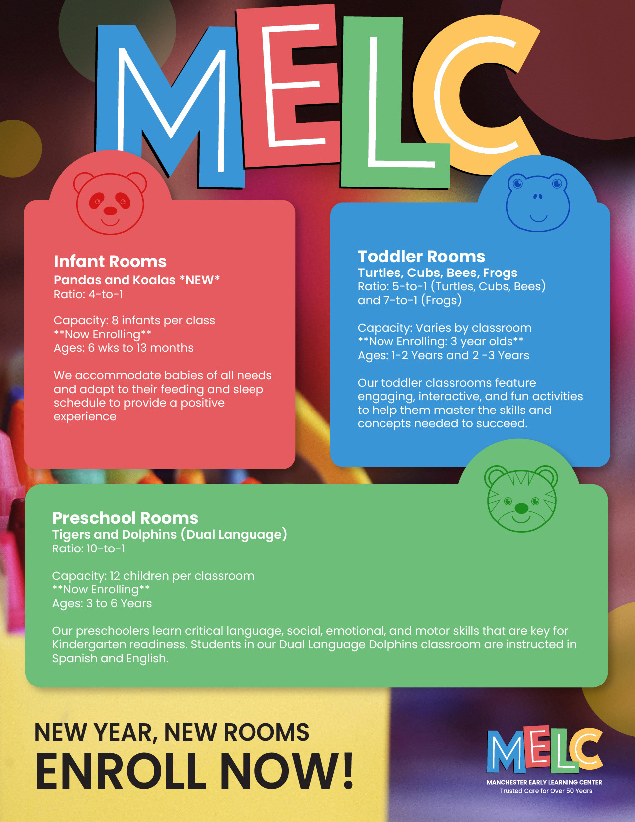
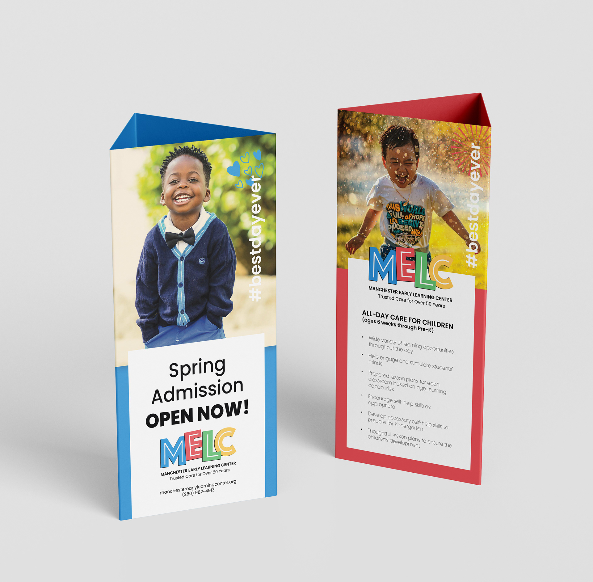
After many iterations, we settled on a refreshing color palette and big blocky fonts. Adding the white lines within the font gives it some interest and style so it shows the daycare is forward thinking and modern.