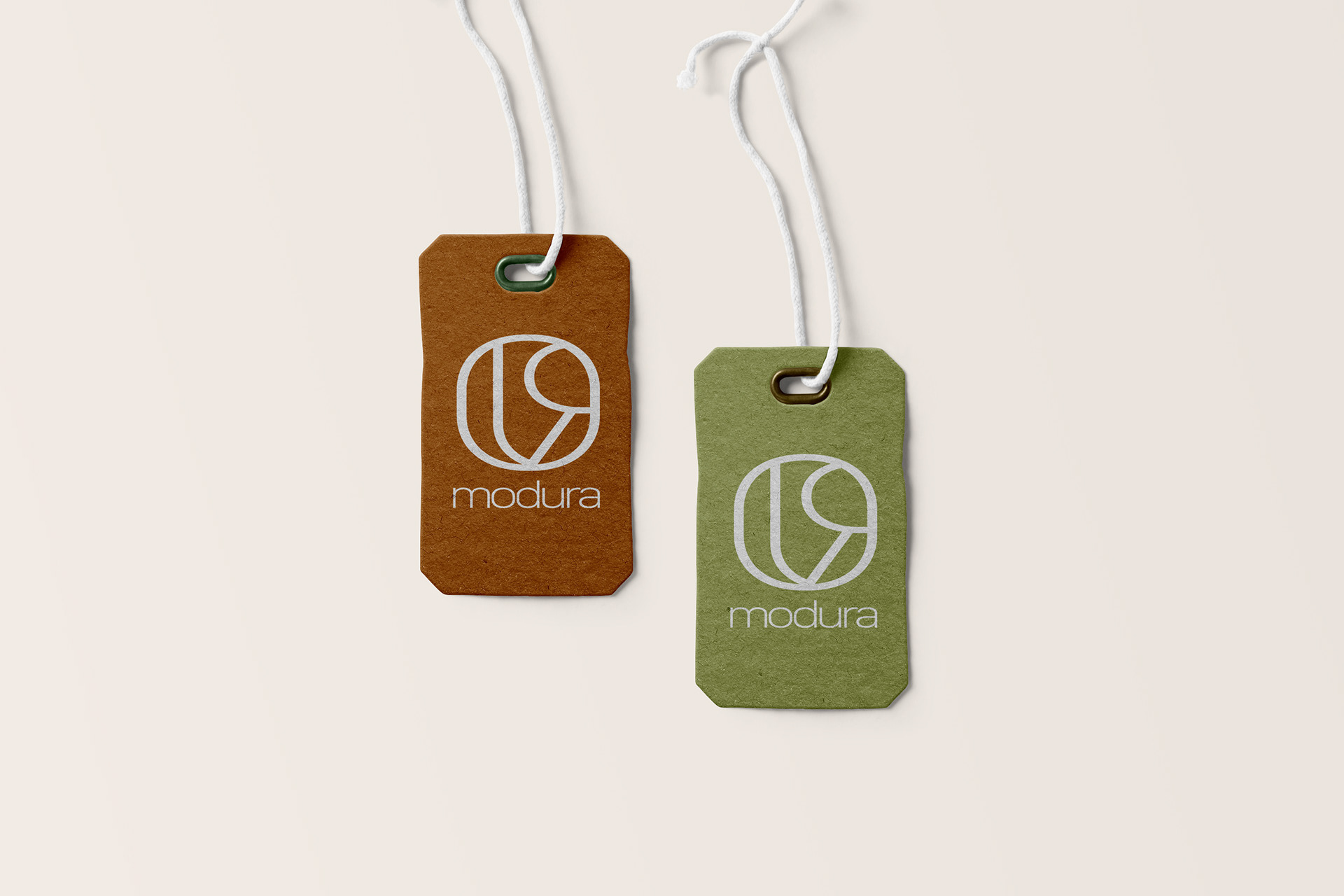
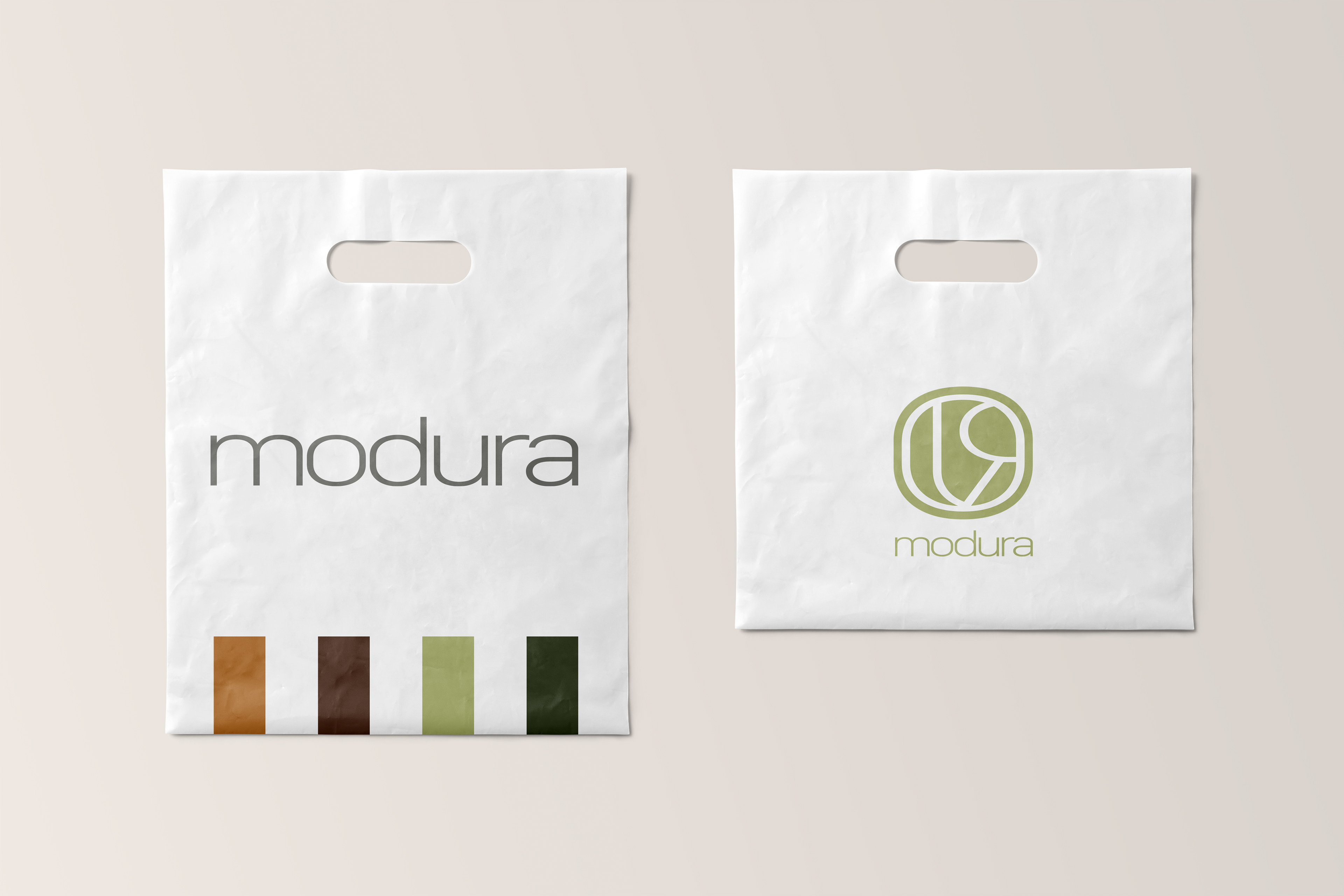
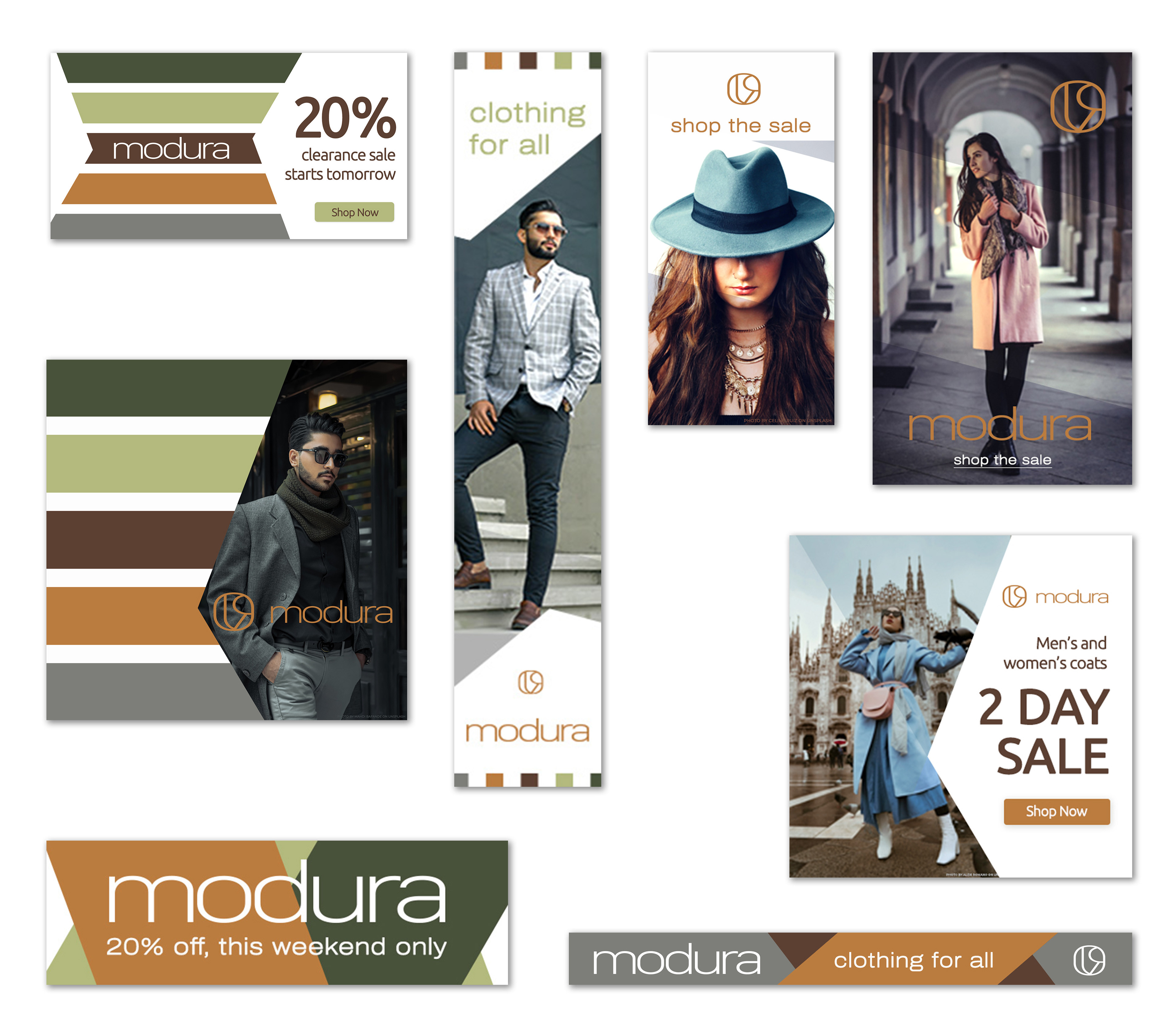
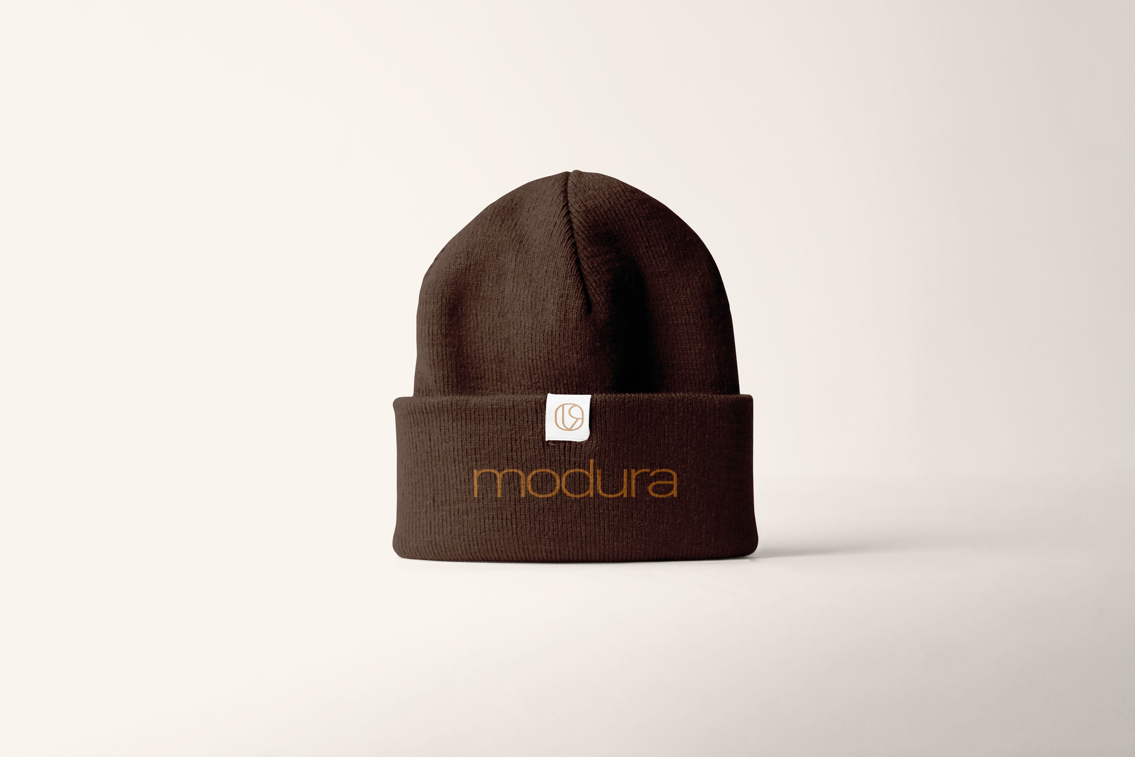
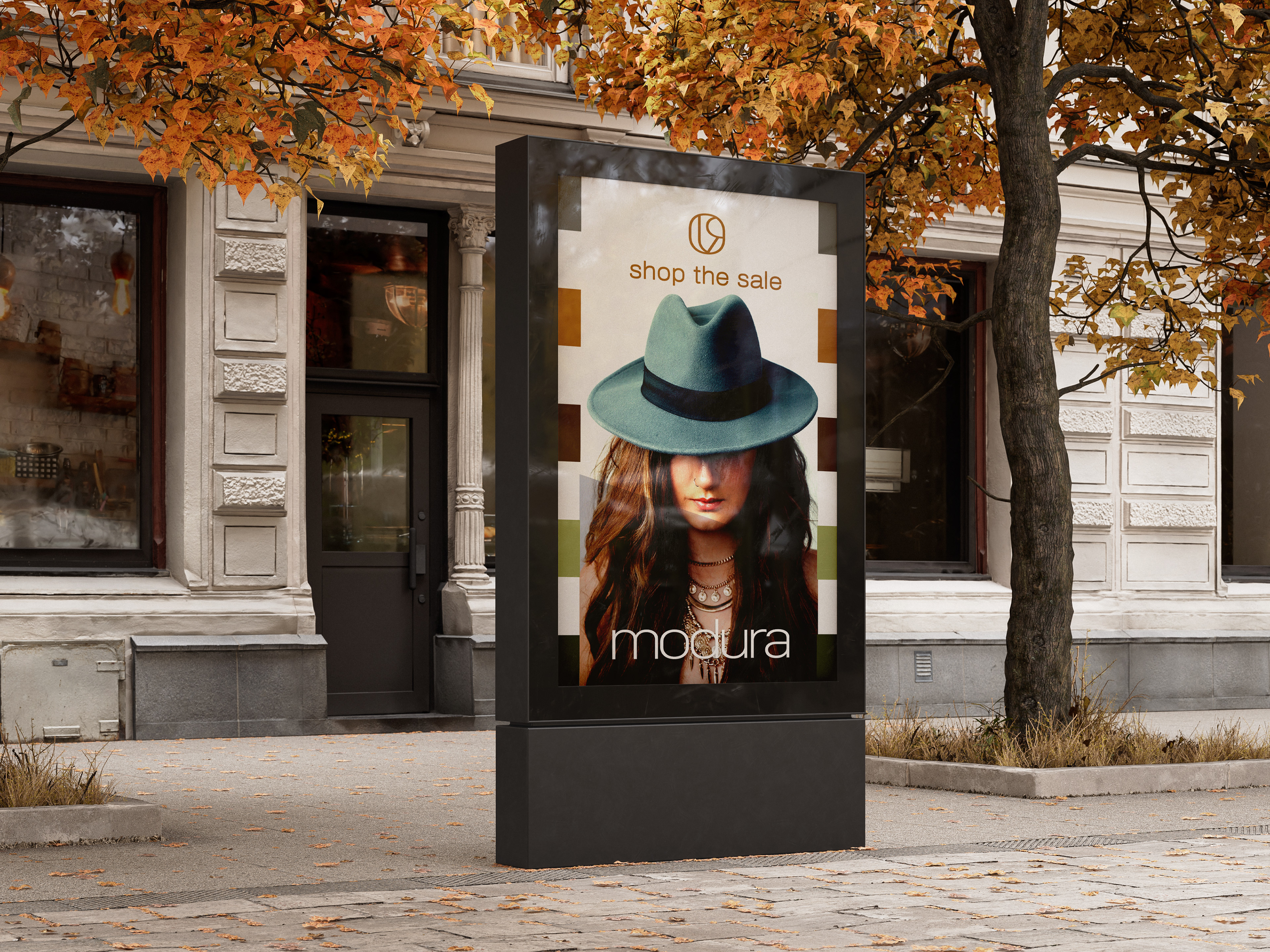
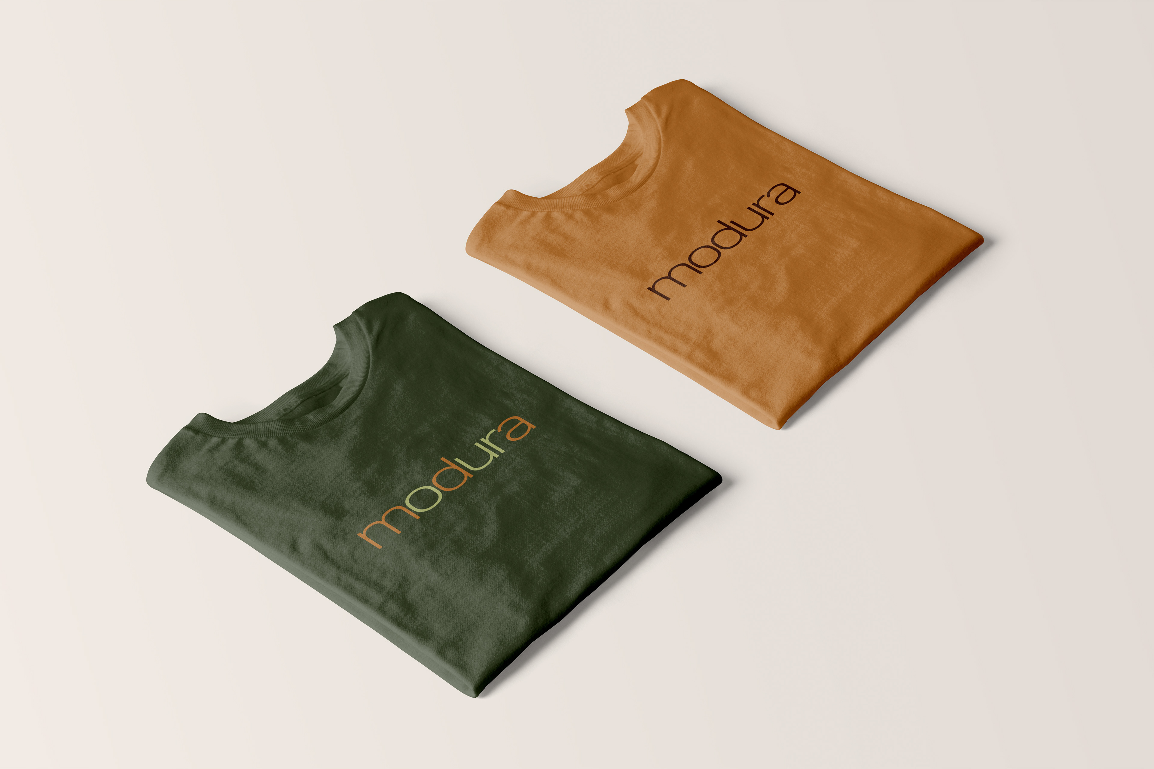
Modura is a new, local clothing brand that needed a full brand identity design. The client specifically requested a classic-styled logo that had longevity. No trendy styles, colors, or fonts that would look outdated in a few years.
SOLUTION
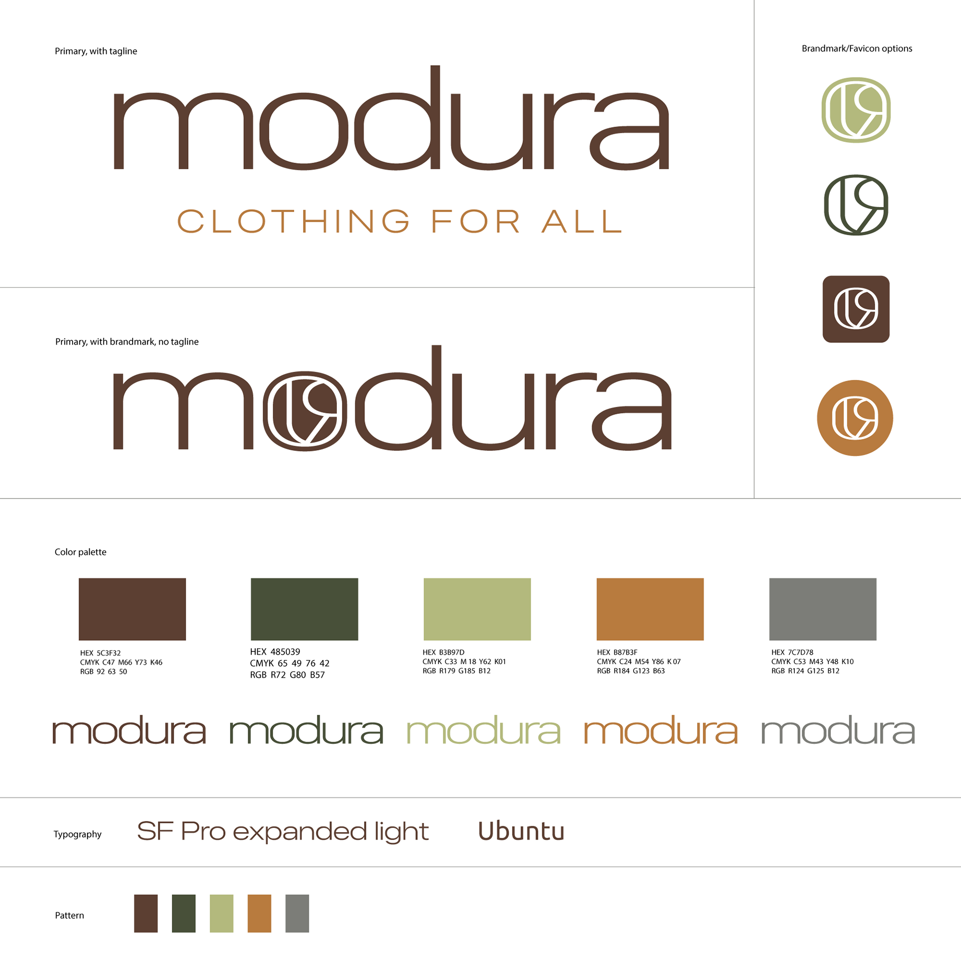
I put the company's name is all lowercase intentionally to give it a youthful feel, yet the tagline is uppercase to balance the 'classic' style.
I noticed was the name Modura included the letters OUR, which to me, also resonated with the company tagline 'clothing for all'. So I created the brand mark to be a stylized combination of those three letters.
The color palette of earth tones is equally sleek and classic, and works well for both print and digital design.
