The client had reached out to me to do a design evaluation for their website. I noticed their logo was difficult to read, and offered to re-design the logo as well.
SOLUTION
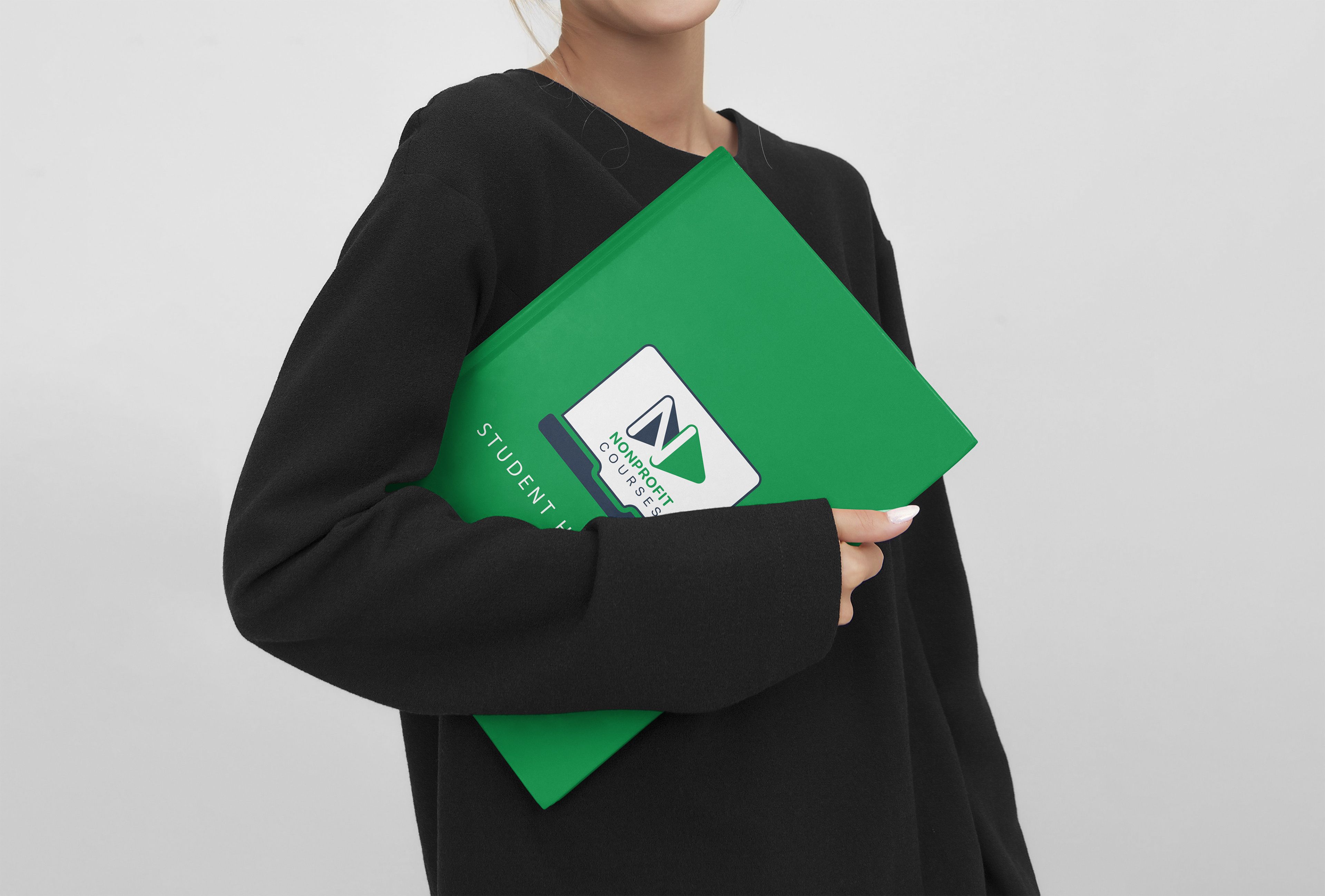
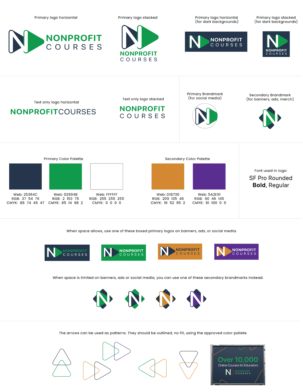
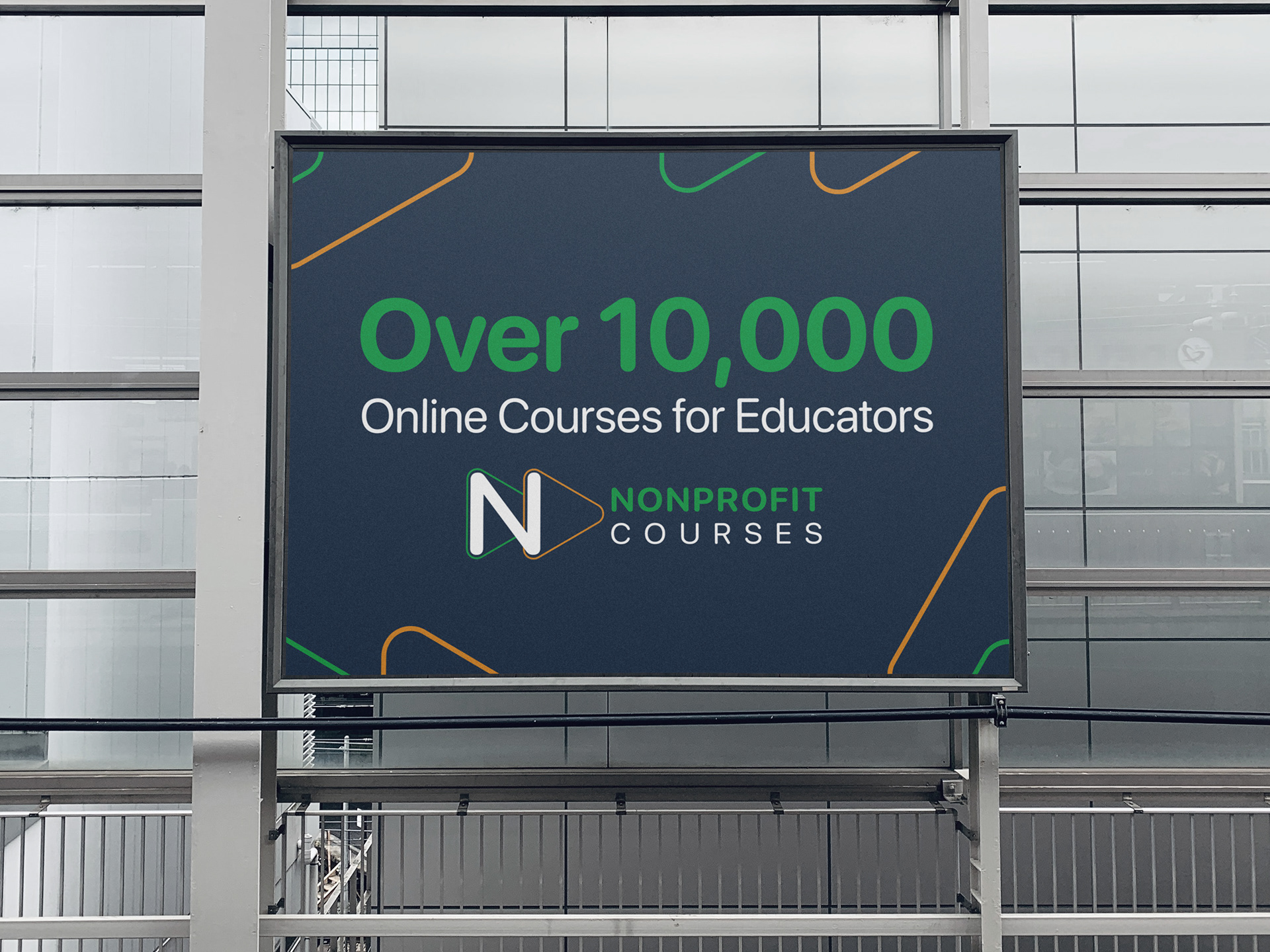
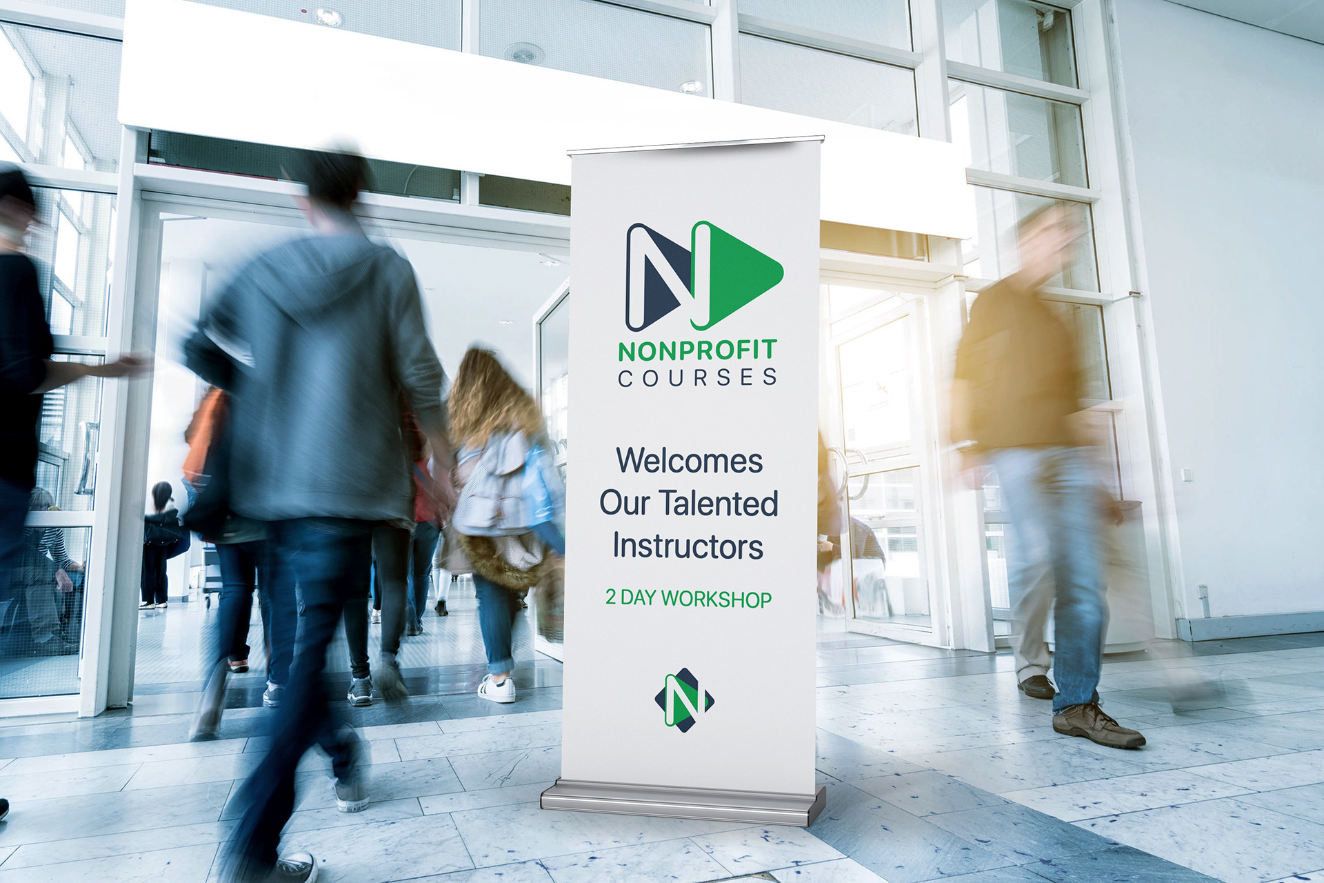
A double arrow icon (represents fast-forward) also morphs into the letter N quite nicely. A perfect way to represent a company that is all about educational videos! The double arrows can also be used as a pattern or part of a design backgrounds, where applicable.
The font is now much easier to read, yet is simple and understated intentionally as to not detract from the brand mark.