Primo Real Estate is a new business that needed a full brand identity. They sell luxury homes, so the design needed to reflect that.
SOLUTION
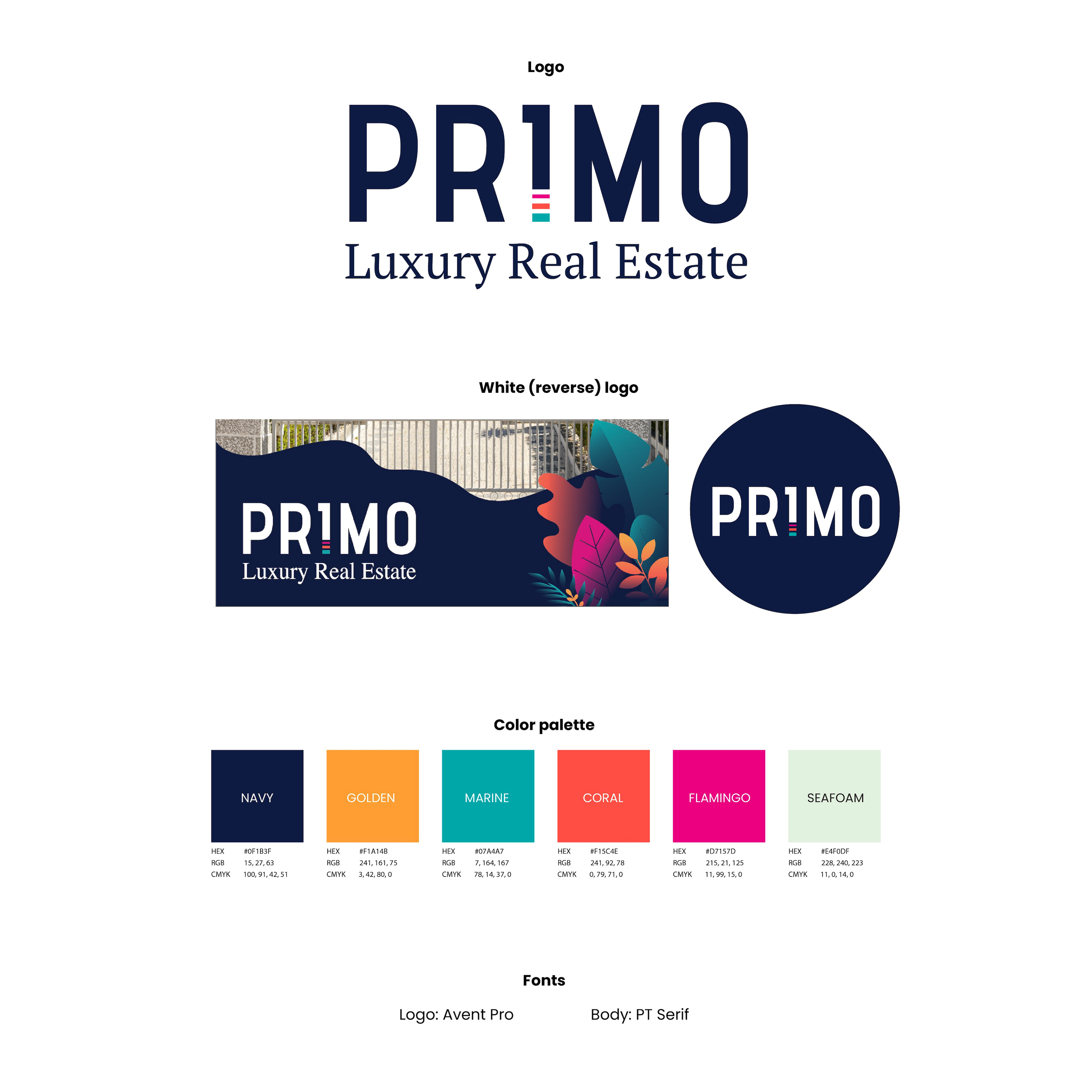
Having a color palette of navy and bright tropical colors is intentional based on their location. Plus blue is known as the color that represents 'trust'. As for the logo itself, I altered the letter 'I' to look more like the number 1 so it subconsciously hints they are a #1 real estate company.