The RXG logo needs a serious makeover. Here is how I envision a new brand identity – a pair of cohesive logos that highlight both their internal and external operations.
SOLUTION
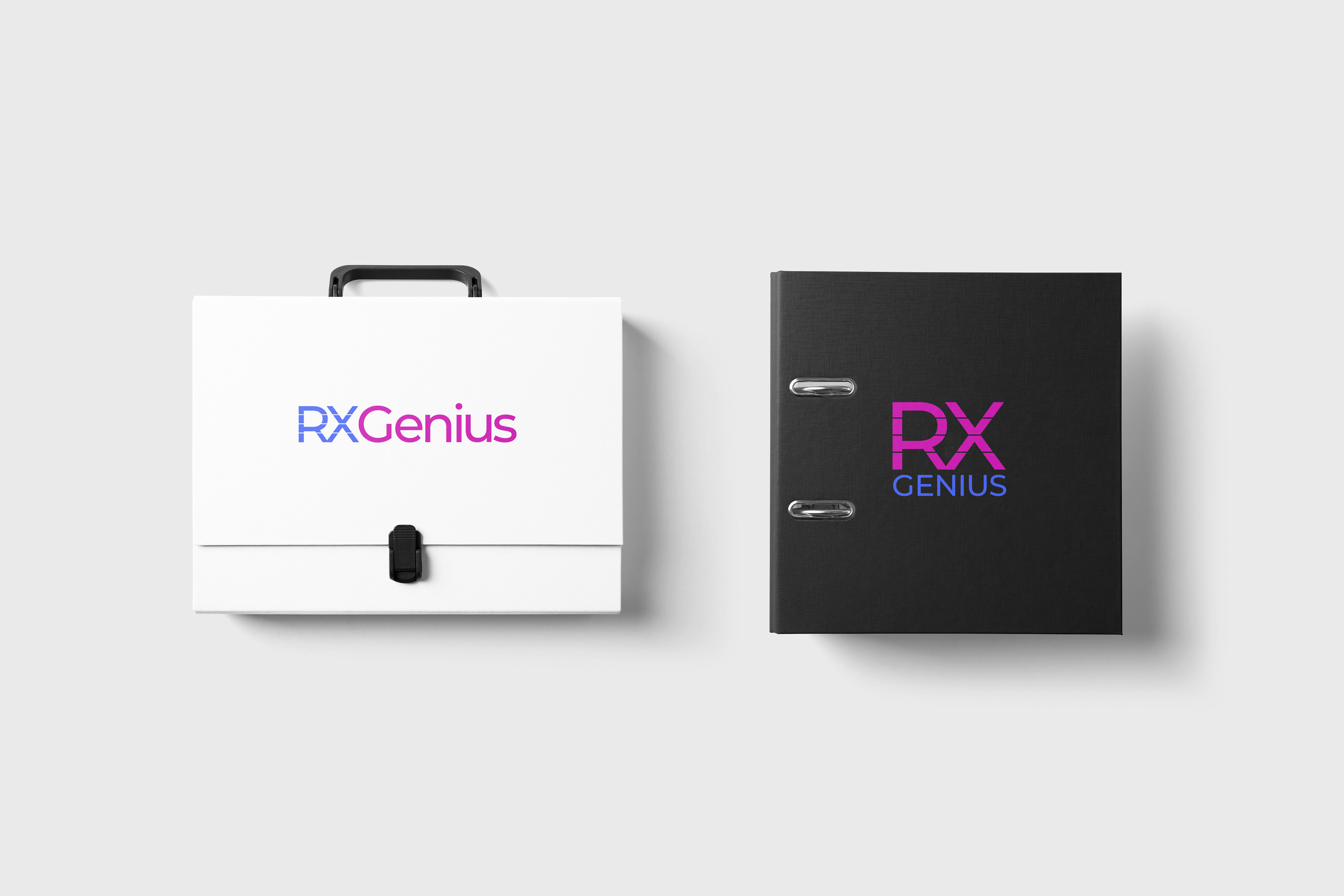
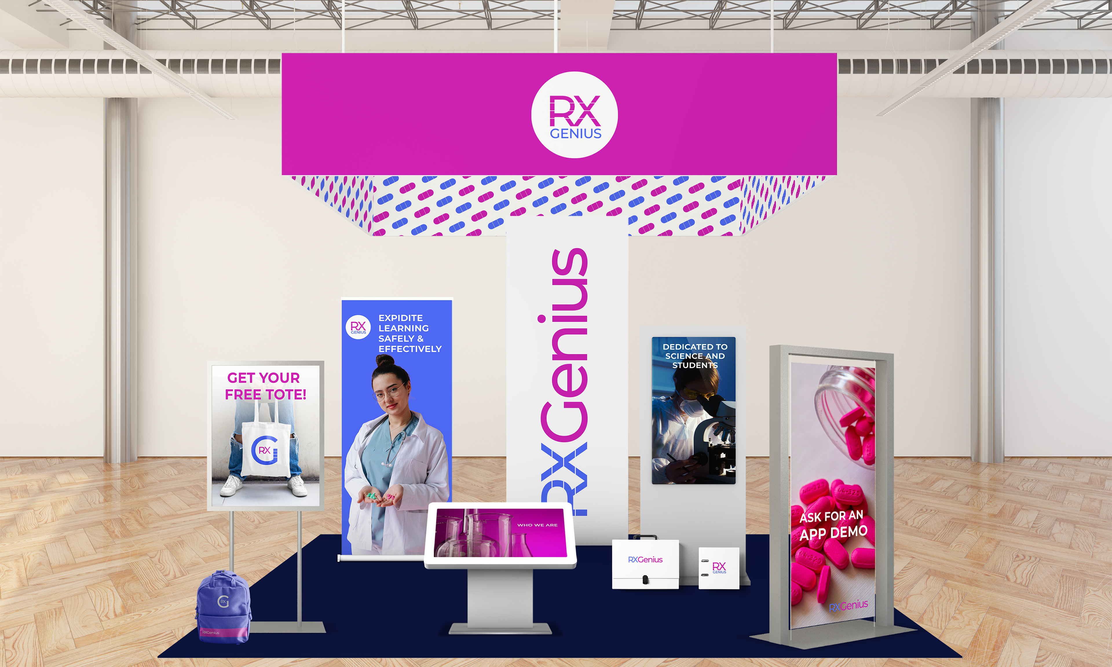
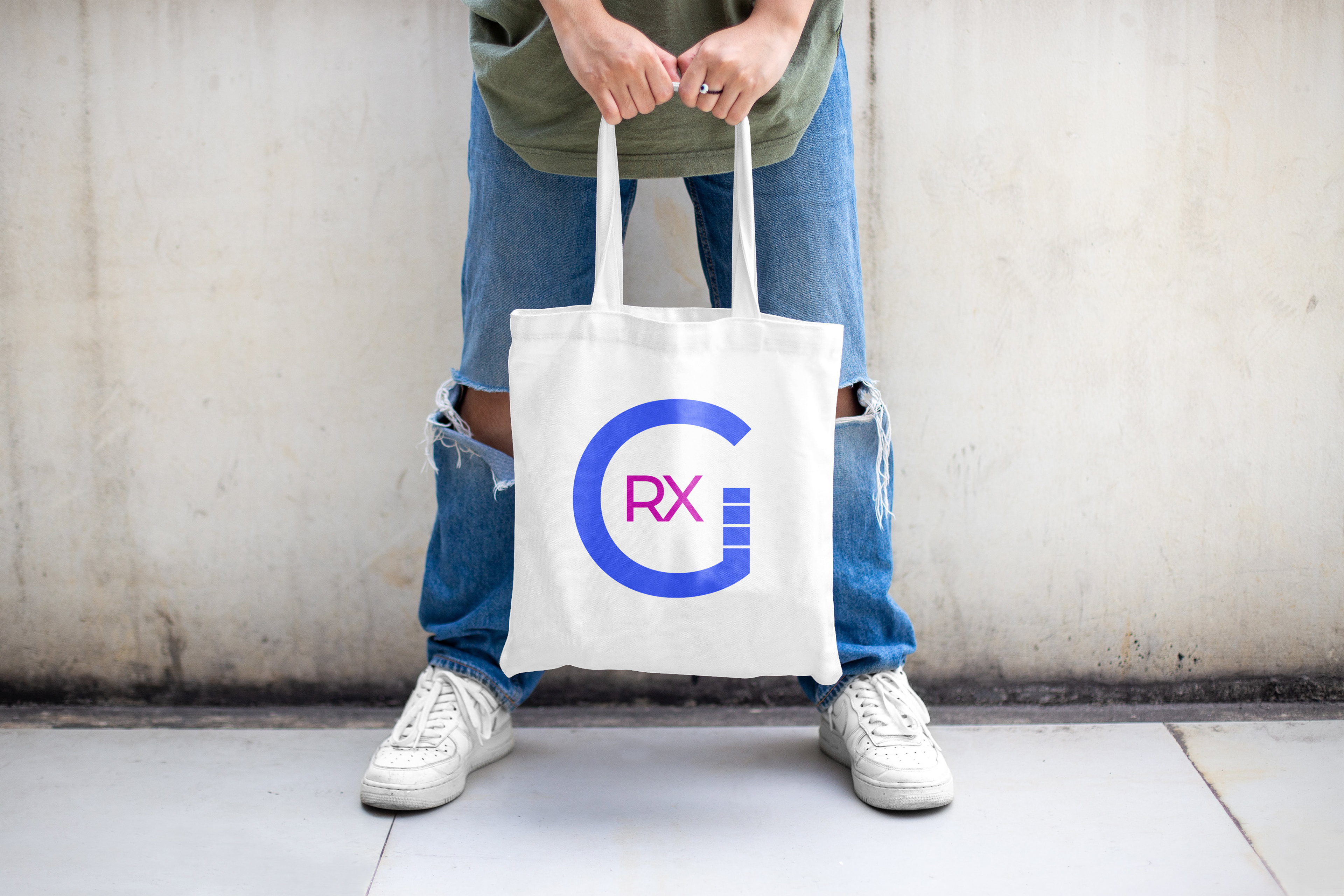
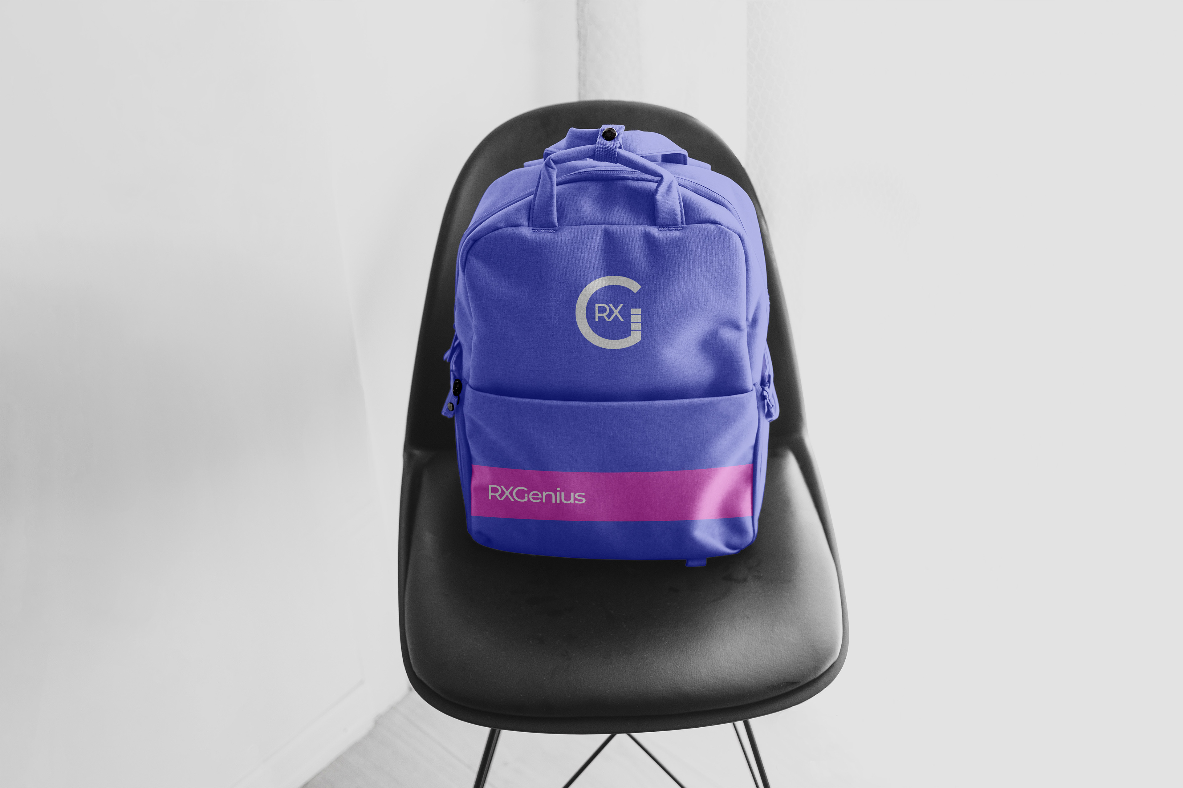
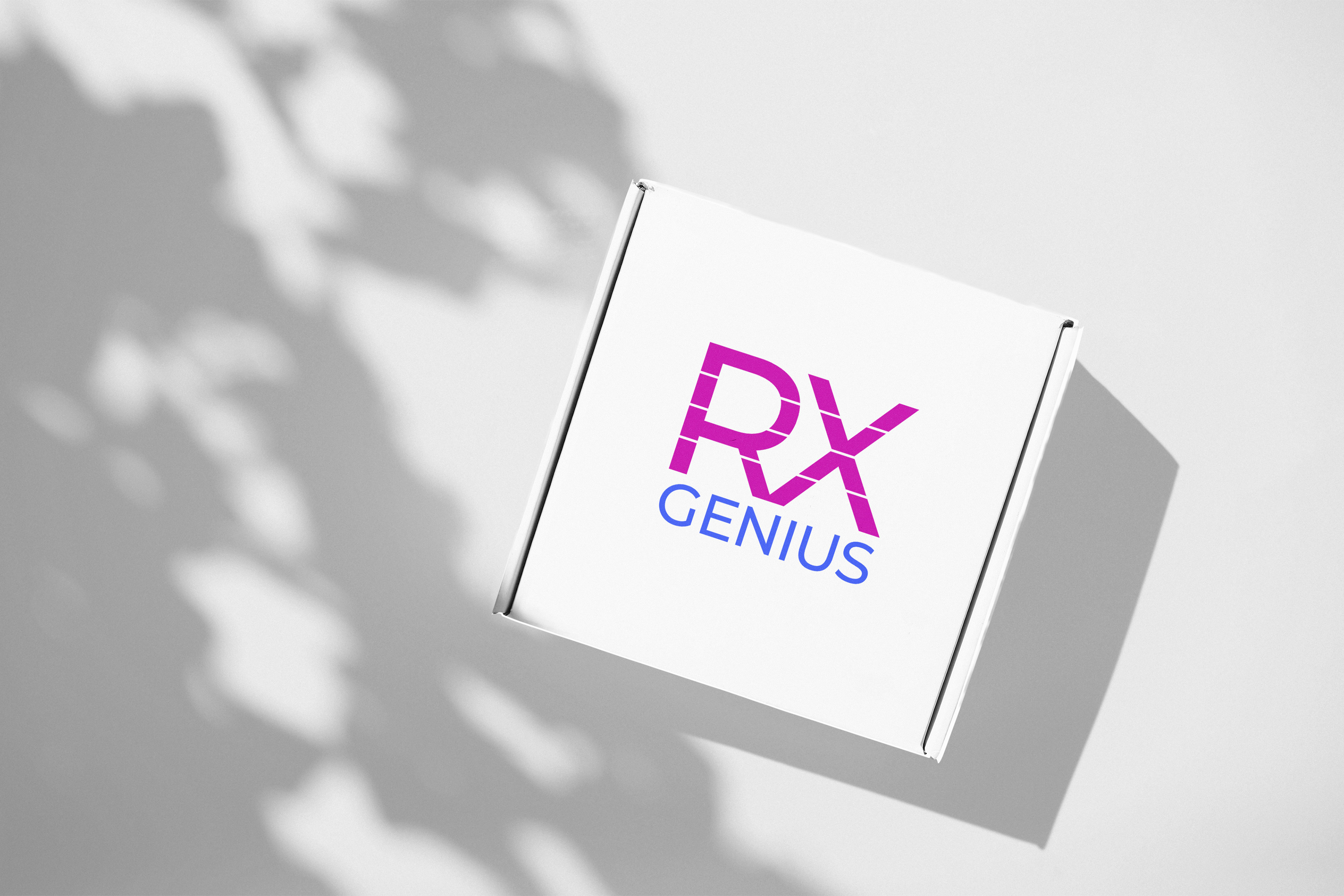
For the external logo, I added lines in the letters R and X to represent a prescription pad. This logo would be used for advertising, social media, and merchandise.
For the internal logo, I turned the letter G into a microscope, which represents their research department. This would be used for corporate identity within the company.
As for the colors, I wanted to avoid the typical blue that is usually used in the medical industry. I chose a bright color palette so the brand stands out from the competition.