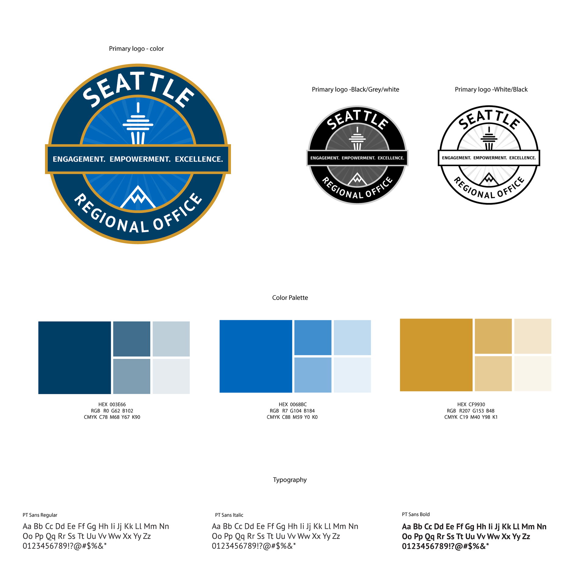
Seattle VA office needed me to update their existing logo which was an odd color combination and very hard to read. As a government agency, they had strict guidelines I had to follow.
SOLUTION
I wanted to highlight the city of Seattle with icons specific to that region. Adding the rays of light behind the emblem is a representation of hope, that veterans so desperately need. This version is a more modern style that is easier to read and more relatable to their target audience.
