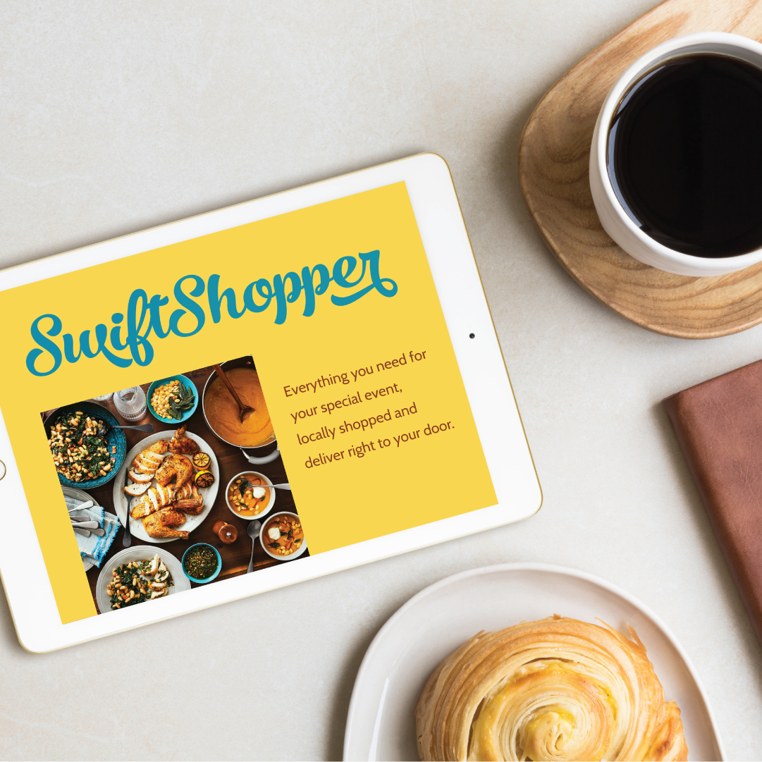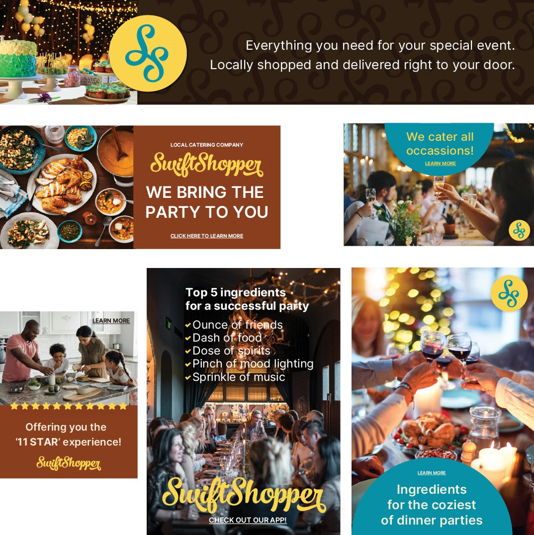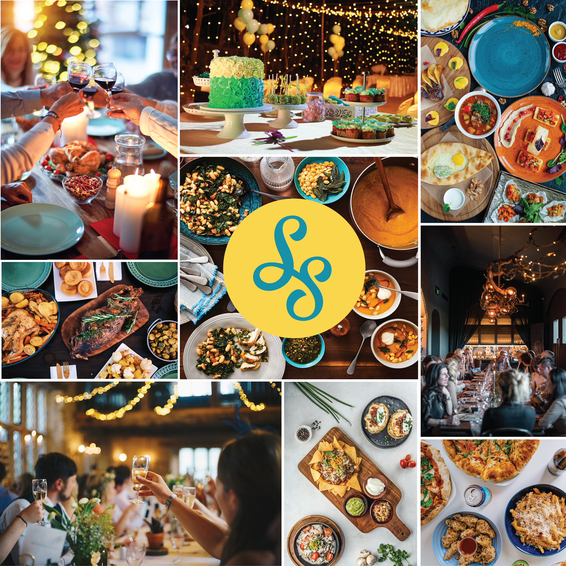
SwiftShopper reached out to me to do a UX case study and brand identity for an app they were building. This would be a local app where people could order their favorite recipe's ingredients to be delivered. Eventually, the business would expand to include cooking and party decorating as well.
SOLUTION
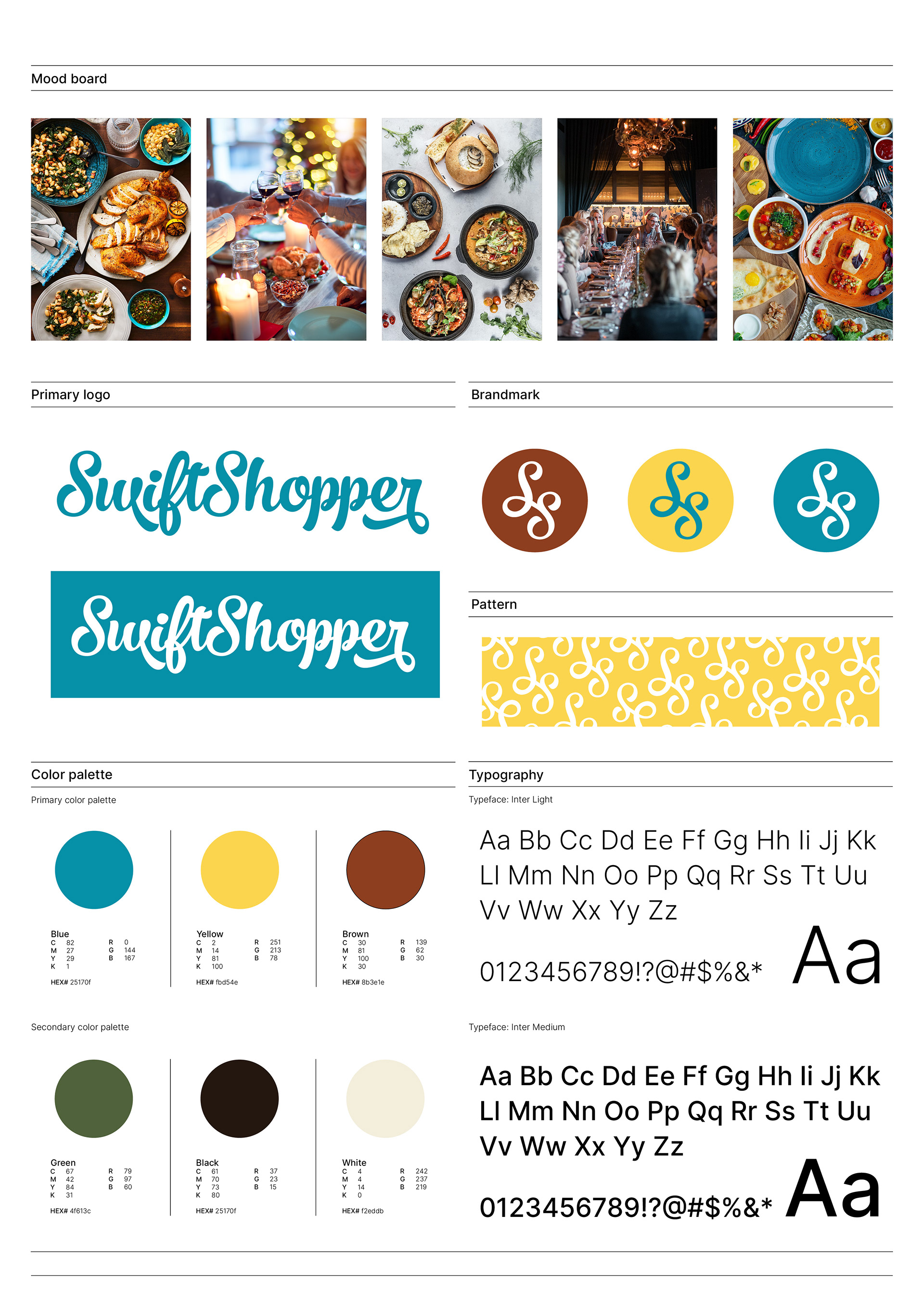
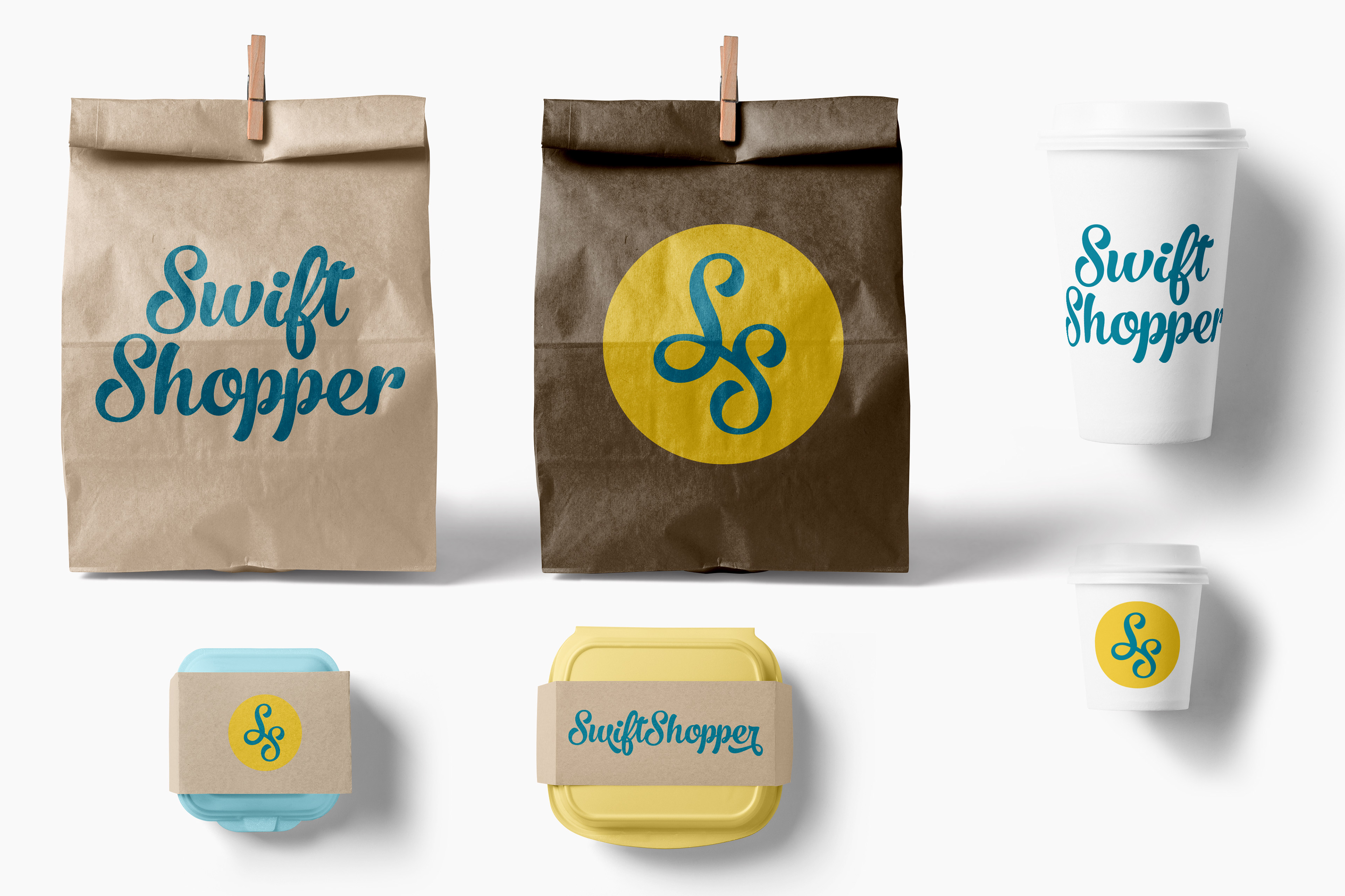
They needed their brand mark to be easily identifiable on app platforms, social media, and package design, which is why I chose the primary color to be yellow with complimentary secondary colors.
While the company is now defunct, I think it was a great opportunity to utilize my UX background to do competitive analysis, research food brands, source brand images, create personas, and design product packaging.