The original logo is so thin it is difficult to read, and lacks a varied color palette for retail packaging. Here is how I would update their brand identity.
SOLUTION
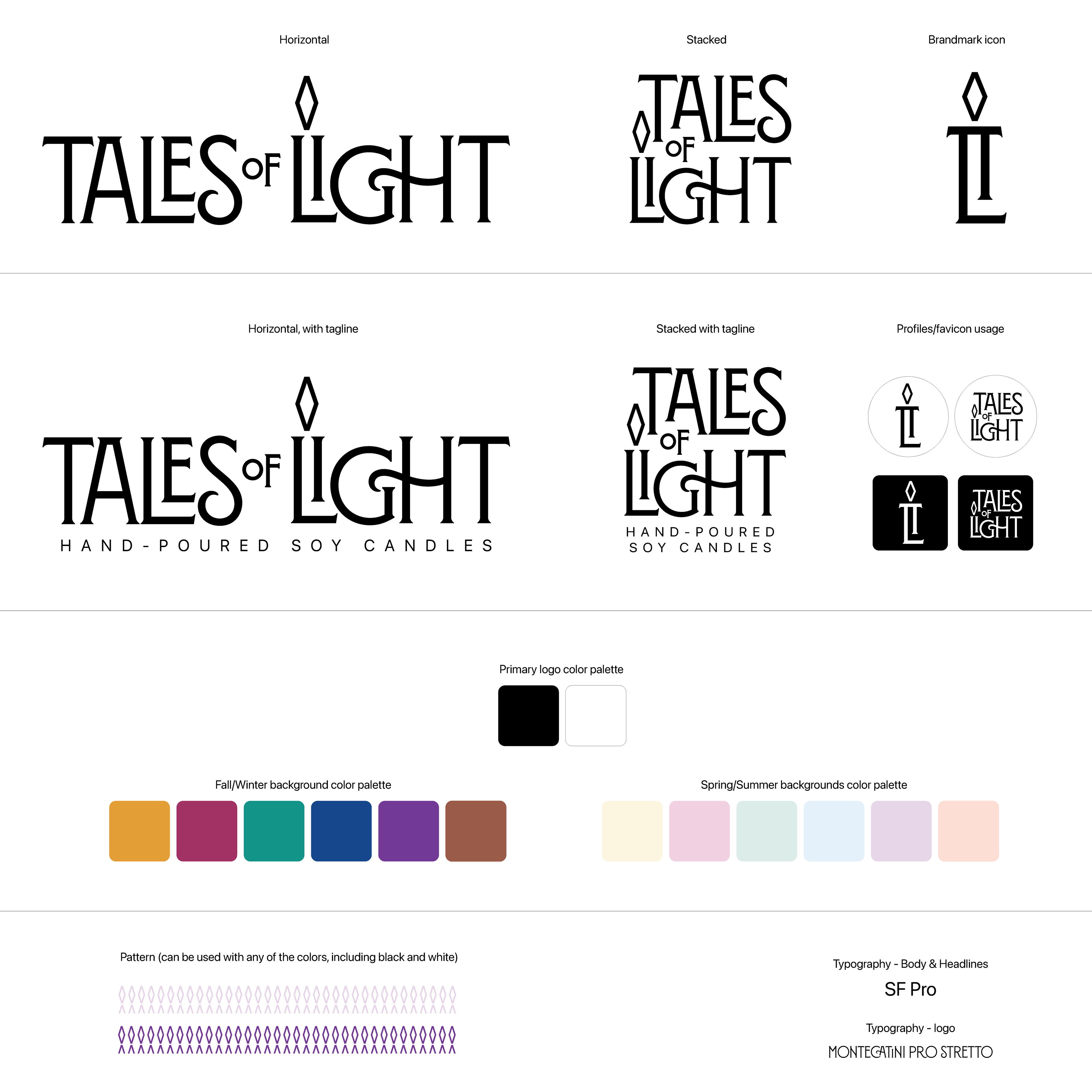
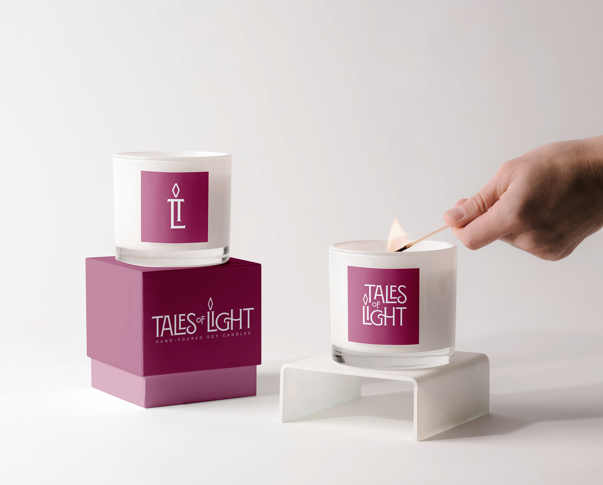
First, step was make the logo that worked well on print and digital, especially packaging. For the brand mark icon, I combined the letters L and I to represent a candle. I used a diamond-shape for the candle flame - which can also be used as an abstract background pattern.
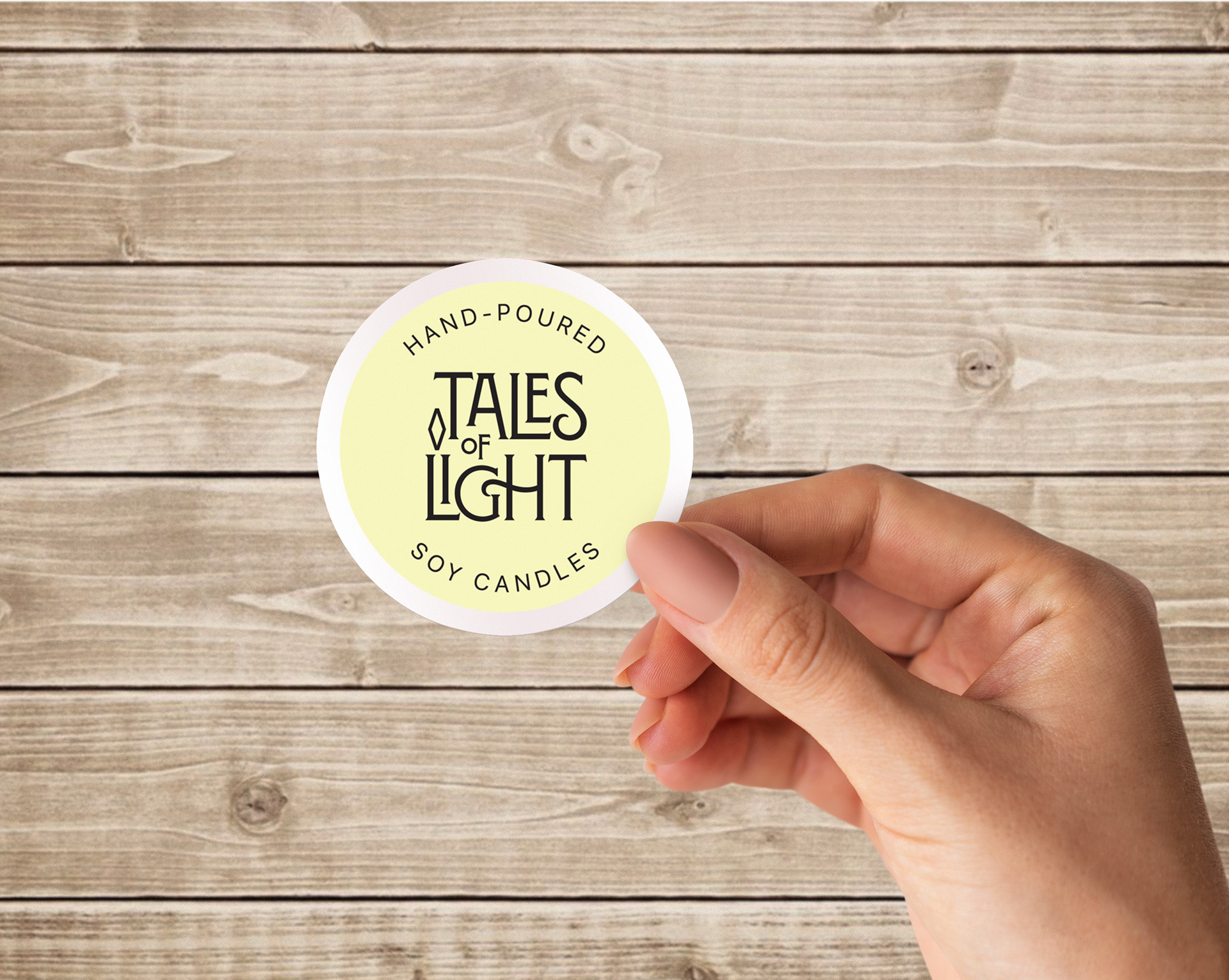
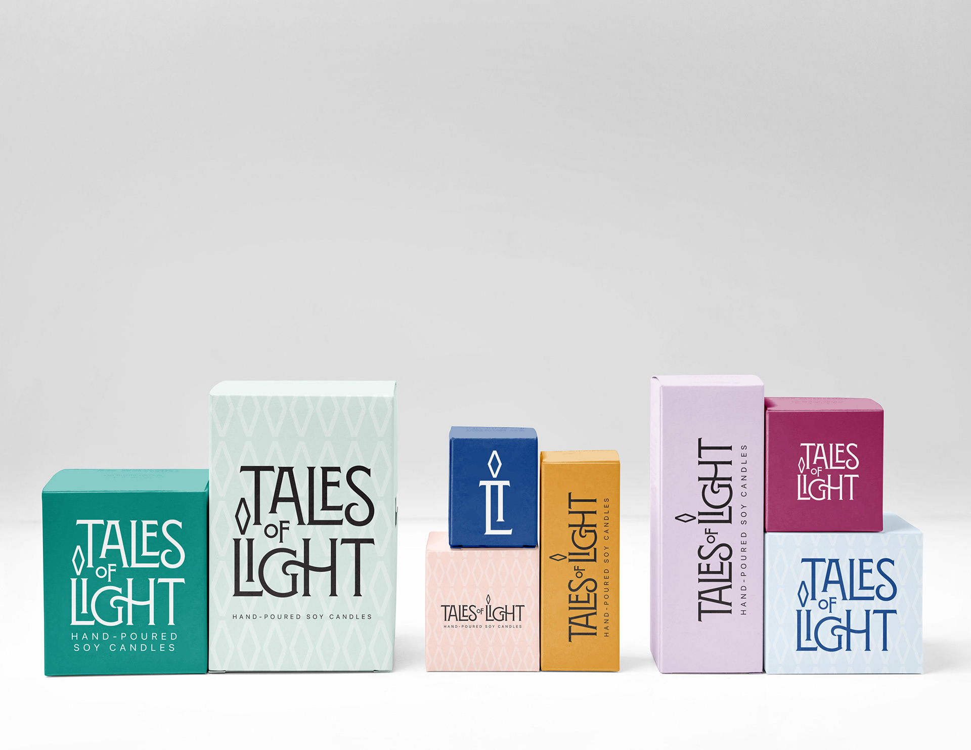
Keeping the logo one color (black or white) allows limitless design opportunities for the background colors throughout the seasons and patterns.


