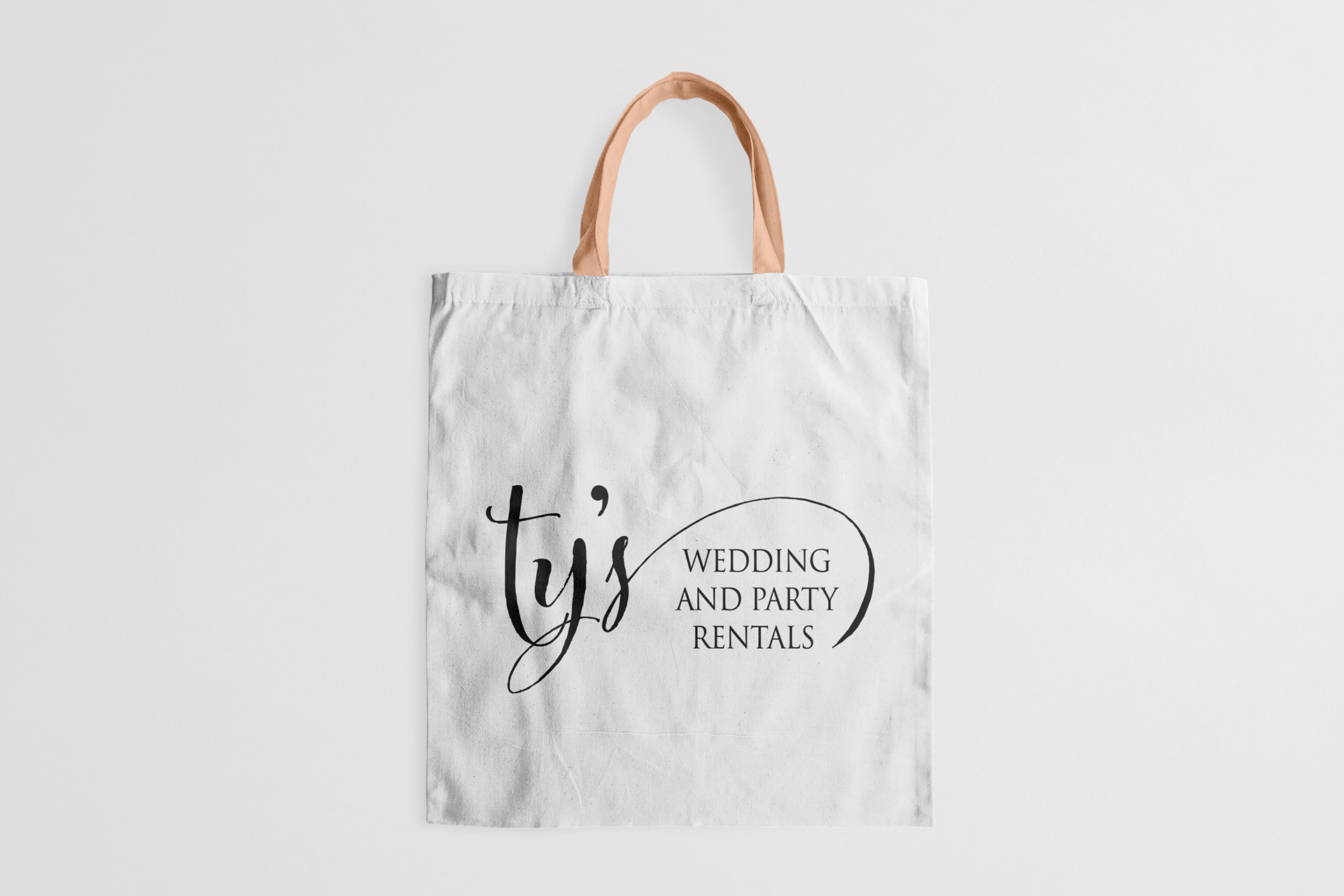
I wanted to create a logo that was more elegant to reflect their business.Their original logo is big and blocky, and the font doesn't reflect the event services they provide.
SOLUTION
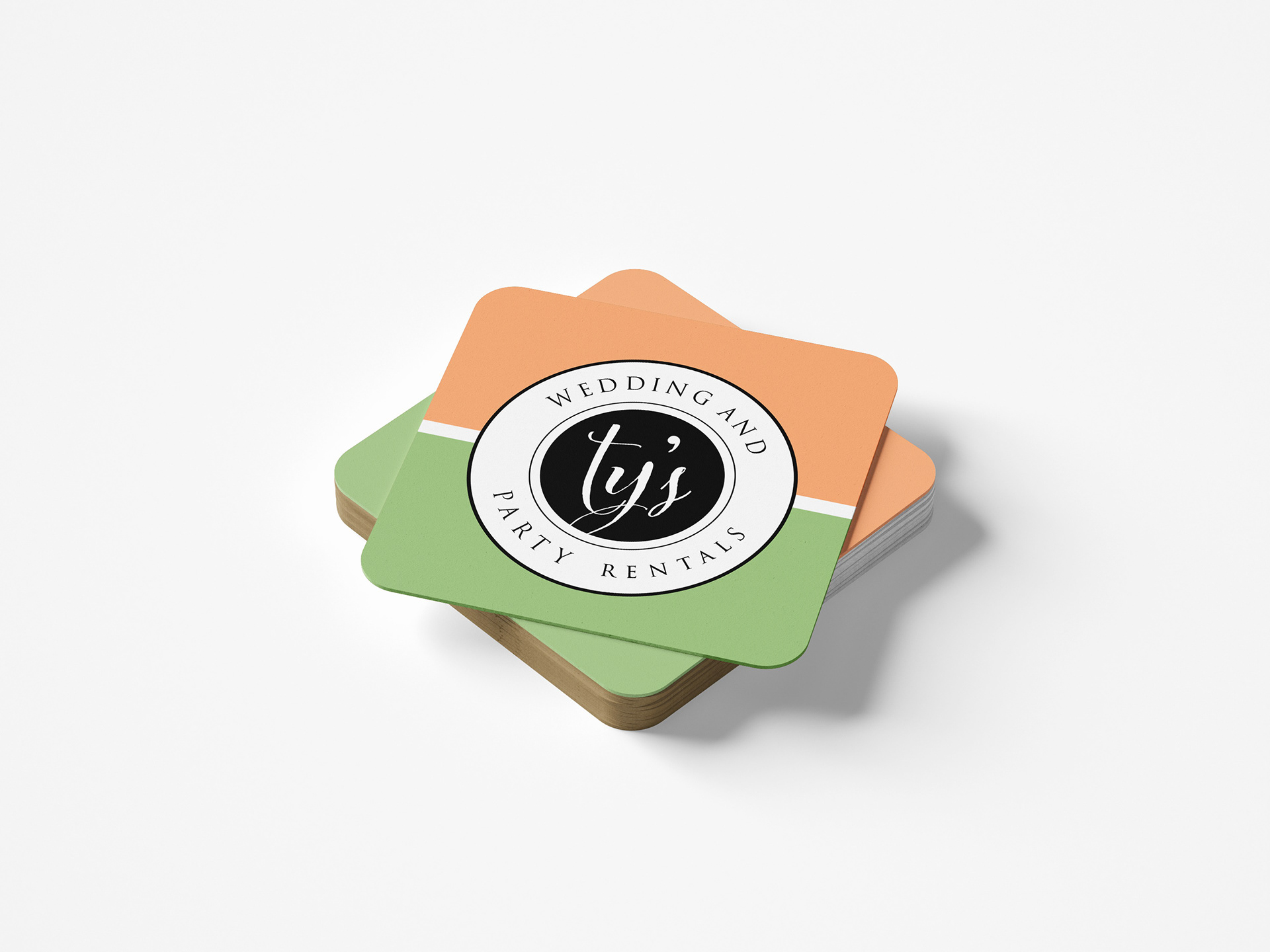
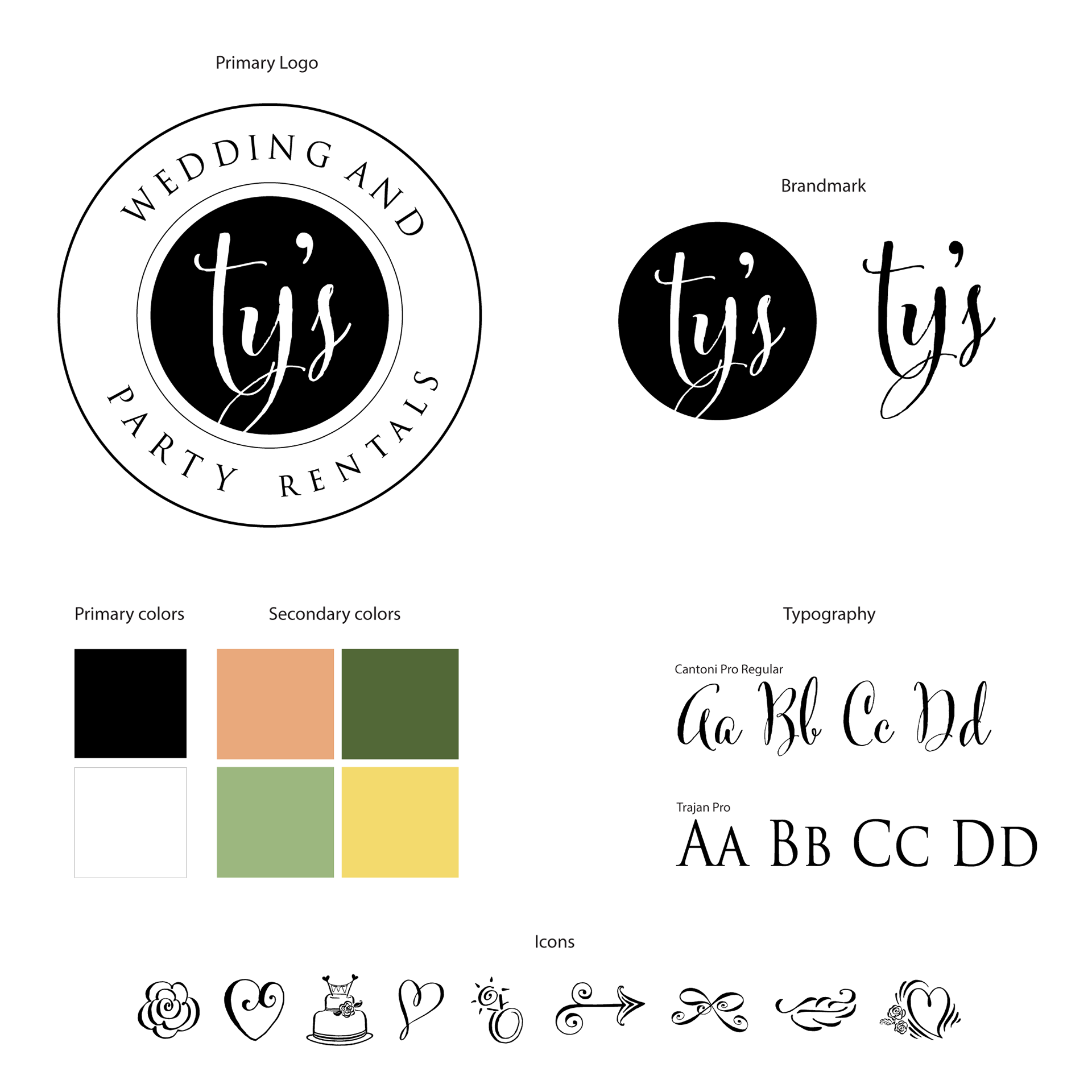
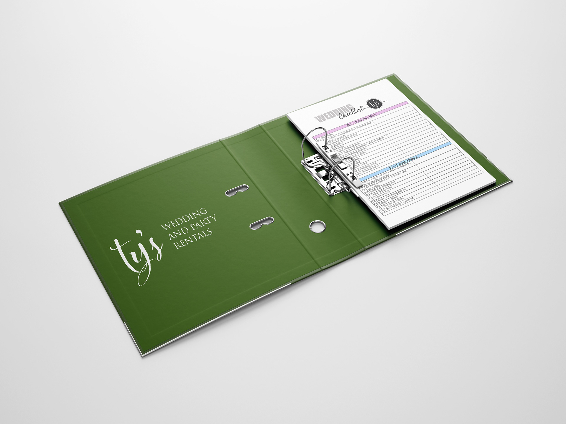
I intentionally kept the logo black and white because it's sleek - yet unexpected for an event company. However, to offset that contrast, I added a springtime color palette that can be expanded later on, if needed.
Combining a hand-written typeface with a narrow, serif font offers that elegant feel that represents all facets of their event business.
